Famous logos XXV — Massimo Vignelli — the designer who taught us to think in systems
Beyond the logo
We live in a time when creating visual solutions has never been easier. Digital tools, endless libraries of images and typefaces, templates and artificial intelligence have dramatically expanded the possibilities available to designers and organisations alike. Yet the abundance of possibilities has created a new challenge — not how to create more, but how to decide what truly matters.
This question was already at the centre of Massimo Vignelli’s work decades before the digital age transformed the way design is created and consumed. Throughout his career, he designed some of the most recognisable identities, publications and communication systems of the twentieth century, but his influence was never limited to individual projects. His greatest contribution was a way of thinking about design as a structured discipline — one where every decision has a purpose and every element contributes to a larger idea.
Vignelli believed that design was not primarily about decoration or personal expression. It was about creating order, organising information and making complexity easier to understand. A successful design was not defined by a single beautiful element, but by the relationships between many elements working together over time.
This approach explains why his work continues to feel relevant today. The visual language of brands has changed dramatically since Vignelli’s most influential projects, yet many of the fundamental challenges remain the same. How can an organisation create recognition across hundreds of different touchpoints? How can information remain clear when audiences are surrounded by constant visual competition? How can a design system remain coherent as it grows?
These are questions Vignelli spent his entire career exploring.
A designer shaped by structure
To understand Vignelli’s approach, it is important to look beyond graphic design itself. His thinking was deeply influenced by his early education in architecture and by the European modernist movement that shaped his understanding of form, proportion and order.
Architecture taught Vignelli to think about relationships rather than isolated objects. A building is not defined only by one wall, one window or one material. Its meaning comes from how all parts work together within a larger structure. He brought the same principle into visual communication. Same value was driven by Swiss graphic designer, educator and writer Josef Müller-Brockmann. The Swiss International Typographic Style emphasised grids, hierarchy and objective communication — ideas that strongly influenced Vignelli’s own approach.
For Vignelli, a logo was never simply a mark placed on different materials. It was the foundation of a visual language that needed to function consistently across different environments. Typography, colour, spacing, imagery and layout all had to support the same underlying idea.
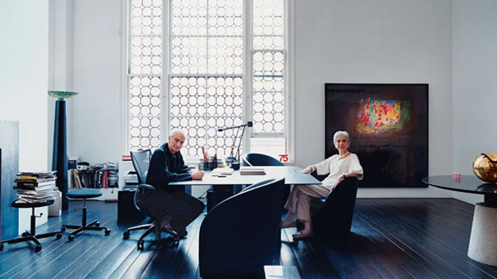
Massimo and Lella Vignelli at their home studio
Together with his wife Lella Vignelli, he built a practice that crossed traditional boundaries between disciplines. Their work included graphic design, architecture, product design, exhibitions and corporate identities. This multidisciplinary approach helped shape his belief that good design principles were not limited to one medium.
The same questions existed everywhere:
What is essential?
What creates clarity?
How do individual elements support the whole?
These questions became the foundation of his design philosophy.
Designing systems, not symbols

Massimo Vignelli and Heinz Waibl set the logotype in plain and legible Haas Helvetica and made it half-red and half-blue to use the colours of USA’s national identity. “We wanted to make one word of American Airlines. There were no other logos then that were two colours of the same word. So we took the space away and split it by colour. We proceeded by logic, not emotion. Not trends and fashions” (M. Vignelli).
A double ‘A’ monogram version featuring a stylised eagle was also used on the tail of the planes. The graphic design of the eagle was attributed to Vignelli for many years, until he revealed that he actually refused to draw it: “I wanted the eagle to be real. It has to have every feather. If you do an eagle, do it with the dignity of an eagle. Don’t stylise the eagle and make a cartoon out of it” (M. Vignelli). However, American Airlines pilots threatened to go on strike because they wanted the eagle since it always symbolised the company, so the office of Henry Dreyfuss drew it. — by Archivio Grafica Italiana
One of the most important differences between Vignelli’s approach and a purely visual approach to branding was his understanding of systems.
A logo by itself has limited power. Its real value appears when it becomes part of a larger framework that allows an organisation to communicate consistently over time.
This philosophy can be seen clearly in the identity Vignelli created for American Airlines in 1967. At first glance, the design appears simple — a strong wordmark, a restrained colour palette and a stylised eagle symbol. But the success of the identity was never only about the logo itself.
The real achievement was creating a visual system that could operate across an entire global organisation. The identity needed to work on aircraft, signage, uniforms, printed materials, advertising and countless other applications. Every individual element had to feel connected, even when appearing in completely different contexts.
This is where Vignelli’s understanding of branding becomes particularly relevant today. Many organisations still approach identity as a collection of separate assets — a logo, a presentation template, social media graphics, website elements. Yet without a shared structure connecting these parts, consistency becomes difficult to maintain.
As we explored in The hidden cost of visual inconsistency, brands rarely lose clarity because of one major failure. Instead, inconsistency develops gradually through small decisions that appear harmless individually but slowly weaken the overall system.
Vignelli understood that consistency was not the enemy of creativity. It was the foundation that allowed creative expression to remain recognisable.
Simplicity is not the absence of complexity
Vignelli’s work is often described as minimalist, but that description can easily become misleading.
Minimalism is sometimes understood as simply removing elements until only the essentials remain. However, true reduction requires much deeper understanding. Before something can be removed, its role within the whole system must first be understood.
A simple result is often created through complex thinking. This was one of the reasons Vignelli’s work appeared effortless while remaining extremely disciplined. His designs rarely depended on visual effects or temporary trends. Instead, they relied on proportion, typography, hierarchy and structure. The challenge of minimalism is not creating something empty. The challenge is creating something where every remaining element has meaning. When fewer elements are present, each decision becomes more visible. Typography carries greater responsibility. Spacing defines relationships. Colour becomes more intentional. There is less visual noise to hide weaknesses.
For Vignelli, simplicity was never the starting point, It was the result of understanding.
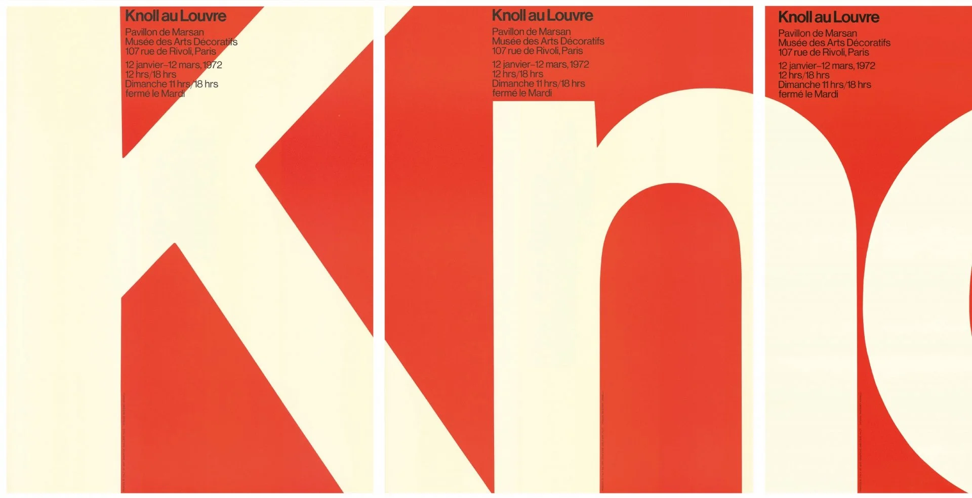
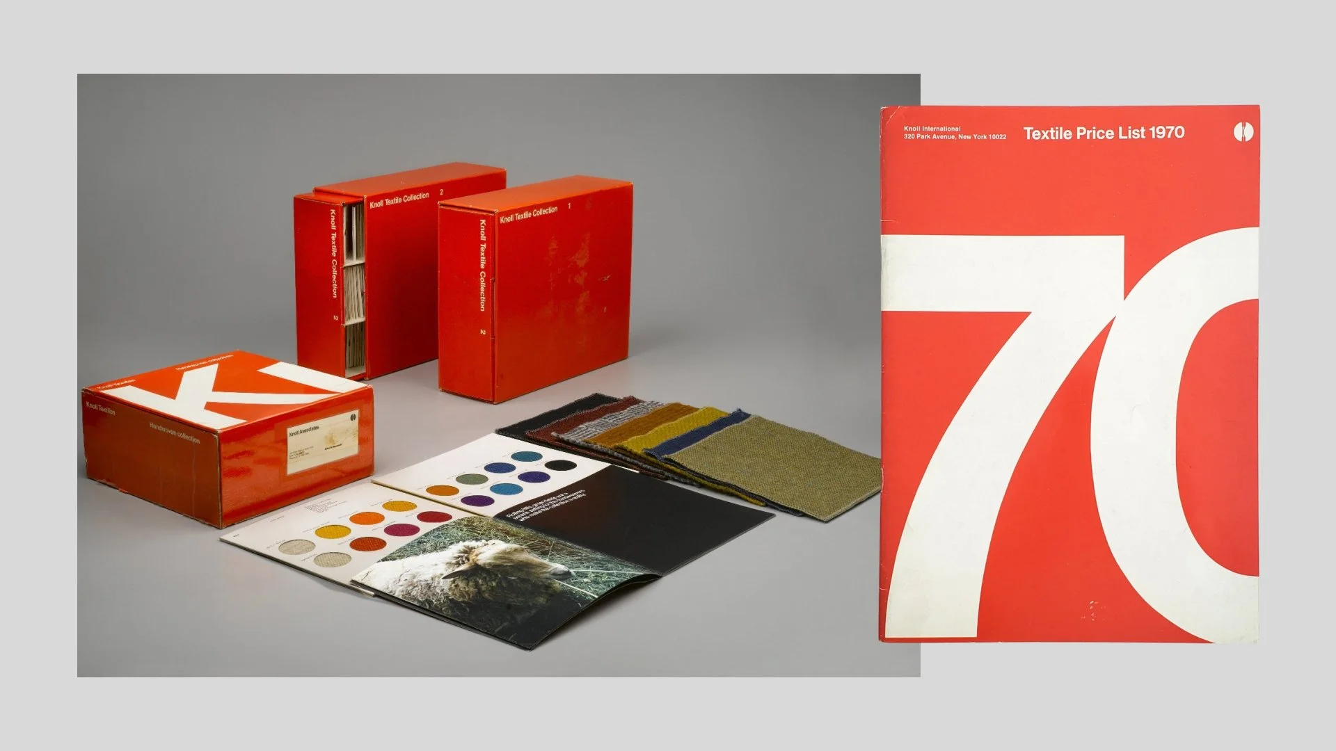
In 1967 Massimo and Lella Vignelli were hired create a new graphics program for Knoll. The resulting designs, based largely on a grid, provided the foundation for all basic communication needs, including stationery, business cards, stickers, tags, boxes, brochures and four-colour ads for trade magazines and publications like The New Yorker, Vogue and Fortune. The identity initially paired Knoll International in Helvetica alongside Herbert Matter’s iconic 1947 Knoll ‘K’ logo. Seen above in a 1972 invitation in the style of a swing tag. And below in a poster, a collection of brochures from 1966 onwards from MoMA’s design collection, a price list and letterhead. The monumental 81.3 x 120.7 cm poster (1967), uses transparent and overlapping letters and underscores Knoll’s identity through typography. The reverse displays drawings of Knoll’s furniture line, which gained visibility when the poster was folded and sent as a mailing piece.
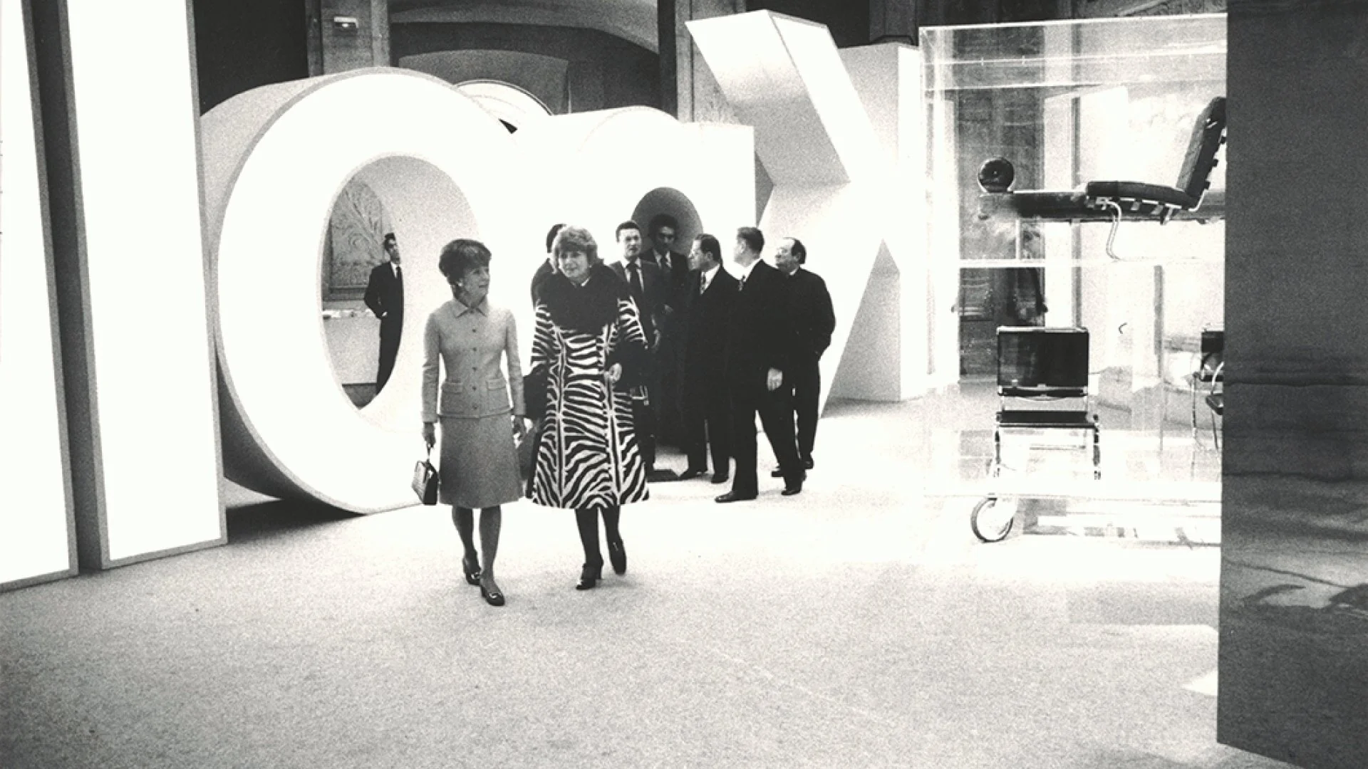
In 1972 the Knoll Au Louvre exhibition heralded a new era for the Knoll company, introducing modern furniture into leading art institutions. The exhibition design and catelogue by the Vignelli’s recieved great acclaim, and by this point, the pair’s sans serif Knoll logo was synonymous with the company itself.
The New York Subway map — designing for understanding
Perhaps no project demonstrates Vignelli’s philosophy better than the New York Subway Map created in 1972.
The challenge was not simply creating a map. It was solving a communication problem. New York’s subway system was complex, with hundreds of stations spread across a large and constantly changing city. A traditional map attempted to represent geographical reality as accurately as possible, but this often made navigation more difficult.
Vignelli approached the problem from a different perspective. The purpose of the map was not to reproduce the city. Its purpose was to help people understand and navigate the transportation system. This distinction allowed him to simplify reality into a clearer visual structure. Straight lines replaced geographical curves. Colours created distinction between routes. Stations and connections were organised according to logical relationships rather than physical accuracy. The result was controversial because it challenged expectations. Many people believed a map should look like the place it represented.
But Vignelli’s solution raised a deeper question about the role of design itself. Should design always show reality exactly as it exists, or should it transform complexity into something people can understand? This question remains highly relevant today. From digital interfaces to data visualisation, successful design often depends not on showing everything, but on showing what matters. The ability to remove noise without removing meaning is one of the most important skills in contemporary design.
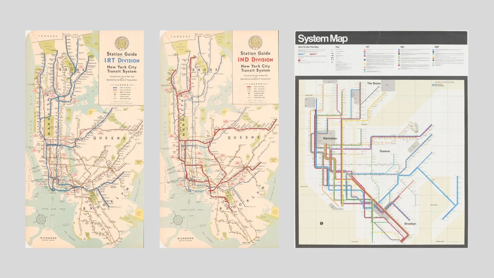
In August of 1972, the New York City Transit Authority (NYCTA) debuted a colorful diagrammatic map of the subway system, now commonly referred to as the Vignelli Map. It was the first map published by the Authority designed by an established design firm. It also incorporated several design ideas into one map that had not been combined before including a service diagram drawn with straight lines instead of curved ones, and the absence of any details that did not convey information to customers. The most obvious stylistic change was to remove the majority of New York’s topography, making most of its boundaries defined by bodies of water. The firm that designed this map was Unimark International. Its principals, Bob Noorda and Massimo Vignelli, as well as other designers including Joan Charysyn, changed the way New Yorkers thought about (and navigated) the subway forever. — by New York Transit Museum
Typography as structure
Typography was one of the areas where Vignelli’s systematic approach became especially visible. For him, type was never a decorative layer added after the concept had already been created. It was one of the fundamental structures through which information was organised and meaning was communicated.
His preference for a limited number of typefaces, most famously Helvetica and Gill Sans, has sometimes been interpreted as a rejection of experimentation. In reality, his approach was not about restricting creativity, but about removing unnecessary decisions that could weaken communication. He believed that every visual choice should serve a purpose, and typography had a responsibility to create hierarchy, rhythm and clarity.
This philosophy reflected his broader understanding of design. A typeface was not valuable because it was fashionable or distinctive on its own. It became valuable when it helped create a coherent system where information could be understood effortlessly.
This is also why Vignelli’s work continues to influence contemporary identity design. Today, many organisations invest heavily in creating visual assets, but often underestimate the importance of typographic consistency. The choice of typeface, spacing, scale and structure determines how a brand communicates before a single word is even read.
Typography is not simply how something looks., it is part of how something works like we discussed in Typography as a silent salesperson article and like Beatrice Warde’s famous metaphor of typography as a “crystal goblet”, Vignelli believed that typography should support communication rather than compete with it.
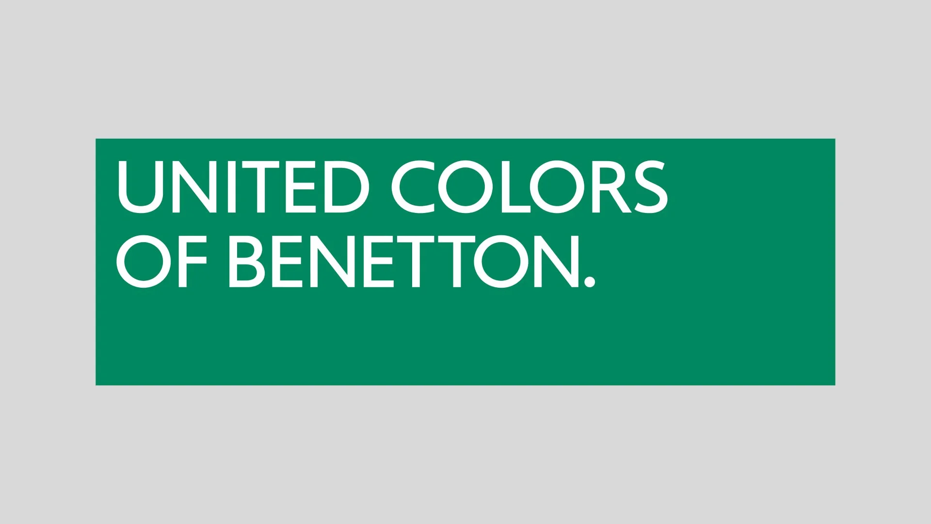
Redesign of the logotype introduced in 1989 by Oliviero Toscani. Part of a new corporate identity program designed by Vignelli. The logotype, set in the corporate typeface based on Gill Sans, is visually clear and suggests a positive attitude towards simplicity. Furthermore, putting the text within the green field emphasizes the idea of the logo as a clothing label. — by Archivio Grafica Italiana
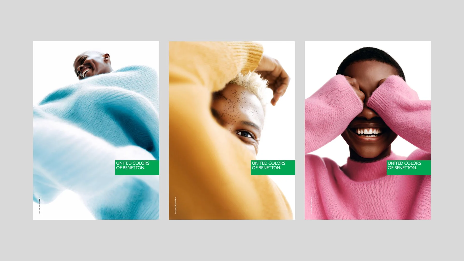
UNITED COLORS OF BENETTON - FW25 - ADULT Sample advertising — by Benetton Group (Brand Communication)
The discipline of timeless design
One of the defining characteristics of Vignelli’s work was his resistance to short-lived visual trends. He believed that design should be built on principles rather than fashion, because trends naturally disappear while strong ideas continue to remain relevant.
This perspective feels particularly meaningful today, when the speed of visual change has increased dramatically. Brands are constantly exposed to new styles, new platforms and new expectations. There is often pressure to appear contemporary, even when change does not solve any real problem.
Vignelli approached design from a different perspective. He was not interested in creating something that looked new for the sake of being new. He was interested in creating something that would remain useful, understandable and appropriate over time.
This does not mean that timeless design is neutral or without character. Some of Vignelli’s work is immediately recognisable because it has a strong point of view. The difference is that the character comes from clarity and intention rather than from temporary visual effects.
A design that follows every trend may appear current for a moment, but it also risks becoming outdated as soon as the cultural context changes. A design built on a clear idea has a better chance of adapting because its foundation is stronger than its surface appearance.
This principle is especially relevant in branding today. The strongest identities are not necessarily those that change the most often, but those that have enough clarity to evolve without losing their meaning.
Beyond the tools — why Vignelli still matters
The environment in which designers work has changed dramatically since Vignelli’s most influential years. Digital platforms have transformed how brands communicate, and technologies such as artificial intelligence are creating new possibilities that were impossible to imagine before. Yet the fundamental challenge of design has remained unchanged.
The difficulty is not producing more options, it is making better decisions.
When almost anything can be created quickly, judgement becomes even more important. The role of the designer is not simply to generate possibilities, but to understand which possibilities contribute to a meaningful solution. In many ways, this makes Vignelli’s philosophy even more relevant today. His work was built around selection, editing and prioritisation. He understood that creativity is not only the ability to add something new, but also the ability to recognise what does not need to be added.
This is where his thinking connects with many contemporary discussions around design. The abundance of choice can create the illusion of freedom while making clear decisions more difficult. Without a strong understanding of purpose, more possibilities can lead to more confusion rather than better outcomes.
Vignelli’s answer was always the same: begin with meaning, establish a system and let the visual expression grow from there.
Thinking in systems today
The language of design has changed since Vignelli’s most influential years. Today, we talk about design systems, digital libraries and scalable brand environments. Organisations create structured frameworks that allow different teams, platforms and communication channels to work together while maintaining a consistent identity.
In many ways, these practices are a continuation of principles that Vignelli applied throughout his career. The tools are different, but the challenge remains remarkably similar: how can a brand grow without losing its meaning? A visual identity is no longer experienced only through printed materials or carefully controlled environments. Brands exist simultaneously across websites, social media, presentations, digital products and countless other touchpoints. Without a clear structure behind them, even strong identities can slowly become fragmented.
This is one of the reasons why modern brand systems are moving beyond traditional guidelines. A document explaining colours, typography and logo usage is valuable, but the real challenge is making those principles accessible and usable in everyday work. Projects such as Identità and its first product Visivo explore this shift — moving brand guidelines from static documents into living digital systems. Instead of treating an identity manual as something created once and stored away, the idea is to make the brand framework easier to maintain, update and share across the organisation.
This reflects a broader change in how we understand visual identity today. A strong brand is not only something that is presented externally; it is also a system that helps people inside an organisation make better decisions every day.
Final thoughts — clarity as a lasting principle
Looking back at Massimo Vignelli’s career, it becomes clear that his greatest contribution was not a particular logo, typeface or identity system. Those projects are important, but they are ultimately expressions of a much larger belief — that design has the ability to organise complexity and create understanding.
The tools have changed. The platforms have changed. The speed at which visual solutions can be produced has changed. But the fundamental questions remain remarkably similar. What deserves attention? What creates meaning? What allows an idea to remain clear as it grows?
These are also questions that shape our own approach at Sviiter. Every identity project begins long before visual execution. We take time to understand the organisation, ask questions, challenge assumptions and build a foundation where design decisions have a clear purpose. Because a strong visual identity is not created by collecting individual elements. It is created by understanding how those elements belong together.
That may be the most enduring lesson from Massimo Vignelli’s work. Design is not only about creating something visually appealing. It is about creating something that continues to make sense.