Designer walks: Rome — seeing a familiar city differently
Rome is one of those cities we keep returning to.
Over the years, it has become one of our favourites, and perhaps that is precisely why it continues to be interesting. The first visit is inevitably dominated by the monuments — the Colosseum, the Pantheon, the Spanish Steps, Trevi Fountain, St Peter’s Basilica. You arrive with a mental list of places that simply have to be seen, and Rome seems almost designed to make that list impossible to finish.
But after several visits, something changes. The question is no longer what to see, but how to look.
Rome becomes less about individual landmarks and more about the strange coexistence of everything around them. An ancient imperial city, Renaissance architecture, Baroque extravagance, Catholic symbolism, twentieth-century modernism and contemporary commerce occupy the same streets, often within a few metres of one another. The city has accumulated centuries rather than replacing them, and that makes walking through Rome feel less like moving through a single place than moving through several different periods at once.
For a designer, that makes Rome particularly difficult to ignore. There is an enormous amount of visual information everywhere — colour, architecture, lettering, signage, materials, proportions, symbols and layers of history. Some of it is remarkably coherent, some of it chaotic, and occasionally something appears that manages to fit into the city without competing with everything around it.
That balance became one of the things we paid more attention to on this visit.
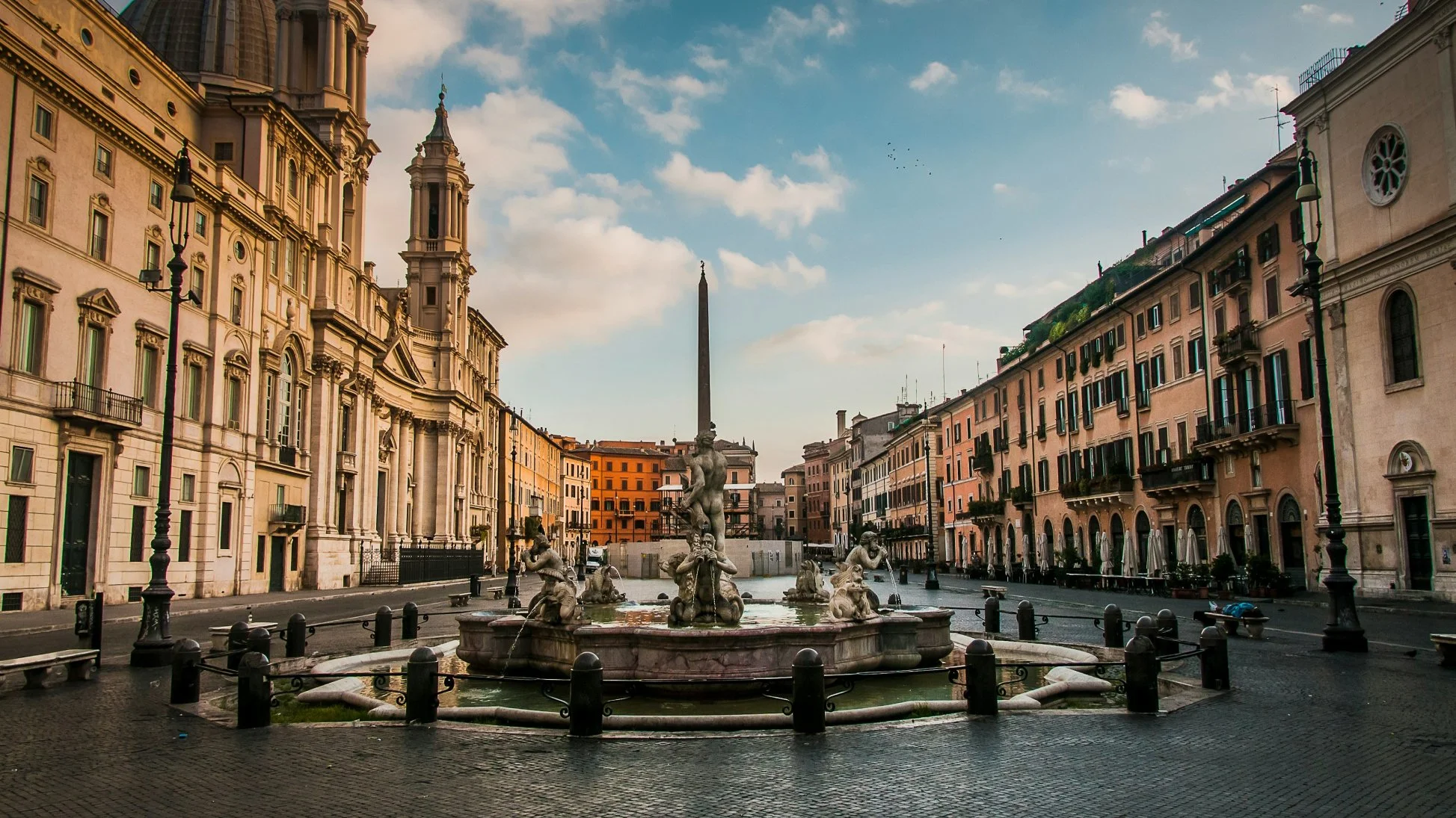
Piazza Navona (photo by Fernando Mola-Davis)
What do you do when you have already seen the Colosseum?
One answer is simple: see it again, but at a different time.
Rome changes dramatically during the day, and some of its most familiar landmarks reveal completely different personalities depending on when you encounter them. Early in the morning, the city gradually comes to life. The first groups gather around the major attractions, cafés begin opening, deliveries arrive, street vendors appear and the flow of people slowly builds around the monuments.
The Pantheon, Spanish Steps, Colosseum and other landmarks become part of that daily choreography. They are no longer isolated historical objects but functioning parts of a contemporary city, surrounded by people who are commuting, selling, photographing, eating, waiting and simply passing through.
Later, towards sunset, Rome changes again.
The light becomes warmer, the stone begins to absorb the last sunlight of the day and many of the city's landmarks are illuminated. St Peter’s Basilica and the statues surrounding the square take on another character, while the Trevi Fountain, Roman Forum, ancient baths and Ponte Sant’Angelo become increasingly theatrical against the evening sky.
There is also a practical advantage to staying out a little later. The intensity of the daytime tourist flow begins to disappear, and walking through the city becomes considerably more pleasant. Streets that seemed crowded a few hours earlier can suddenly feel spacious.
It is perhaps one of the simplest ways of discovering a familiar city again: change the conditions in which you look at it.
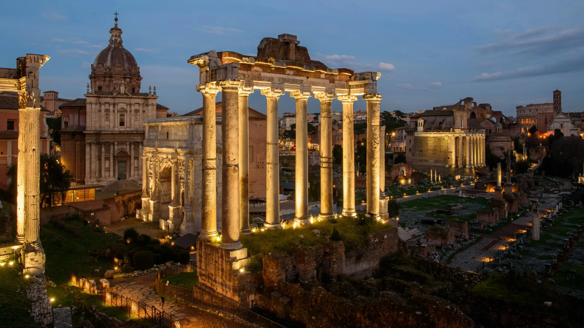
Roman Forum (photo by Matteo del Piano)
Rome rewards a little planning
Rome is, understandably, a city built around tourism. There are countless ways to experience it, from hop-on hop-off buses and guided tours to Fiat 500s, rickshaws and organised excursions that move visitors between the major landmarks.
There is nothing inherently wrong with any of these options. But after several visits, we have found that Rome is at its best when you allow yourself to move through it rather than simply being transported between destinations.
Planning helps. So does public transport.
The metro is particularly useful for connecting the larger areas of the city, while buses can fill some of the gaps. But perhaps the most enjoyable approach is to combine transport with walking and deliberately leave some space between destinations.
Rome is dense with history, and giving yourself roughly half an hour between major stops creates an opportunity to experience the city between the attractions — the streets, façades, small shops, signs, cafés and unexpected details that would otherwise disappear between one landmark and the next.
For us, this is increasingly what travel becomes after the obvious sights have already been seen. The destination matters, but so does everything that happens on the way there.
Finding another Rome through food
One of the ways we explored the city differently this time was through food tours. We joined tours in two very different neighbourhoods, Prati and Trastevere, through Cooking Italy, which took us through a series of small restaurants, cafés, food shops and gelaterias.
The advantage of a food tour is not only the food itself. It creates a reason to walk through neighbourhoods that might otherwise remain outside the usual tourist route, while providing a much better sense of how a city actually eats.
In Prati, the stops included La Nicchia Café, known for its focus on high-quality local ingredients; Pizzarium, the famous pizza-by-the-slice establishment founded by pizza maker Gabriele Bonci; Paciotti Salumeria, essentially a small palace of Italian meats and cheeses; Il Segreto Roma, a restaurant focused on Italian and Roman-inspired cuisine, fresh pasta and an extensive wine selection; and Lemongrass Gelato, which offered a more playful approach to traditional Italian gelato.
Pizzarium was particularly familiar to anyone who has watched Chef’s Table, where Bonci’s approach to pizza and ingredients was featured. But experiencing it in context — standing in the neighbourhood, seeing the people coming in and out and understanding the scale of the place — gives the experience a different dimension from simply knowing it from a screen.
Trastevere offered another side of the city. We stopped at Trapizzino, known for its triangular pockets of pizza dough filled with Roman-style dishes, and also tried arancini, the famous fried rice balls. Trattoria Lungaretta provided a more traditional trattoria experience, while Fonte della Salute offered gelato with combinations that were considerably more experimental than the traditional flavours one might expect.
What connects these places is not a single visual style, but a strong relationship with the idea of place. Ingredients, preparation, presentation and atmosphere all contribute to the experience. In that sense, food is another form of local identity — one that can be understood without knowing the language.
Rome through a designer’s eyes
Rome is often described through its architecture and history, but the visual language of the city deserves just as much attention.
The palette is almost immediately recognisable. Warm sandstone, terracotta and faded ochre dominate many streets, interrupted by deep burgundy, black, dark green and occasional flashes of gold. These colours are not necessarily the result of one coordinated identity system. They have accumulated through architecture, materials, signs and centuries of use, creating something that feels remarkably cohesive despite its complexity.
Typography tells a similar story.
Across signs, advertisements and public information, there is a wide range of contemporary typefaces, but classical forms remain strongly present. Roman capitals and serif lettering feel particularly natural here because the city itself provides an enormous historical reference library. The letterforms carved into ancient stone are not simply historical artefacts; they continue to influence how Rome communicates visually.
This is one of the things that makes Rome interesting from a design perspective. The city does not need to constantly announce its history. Its history is already present in the visual language.
When contemporary design knows when to step back
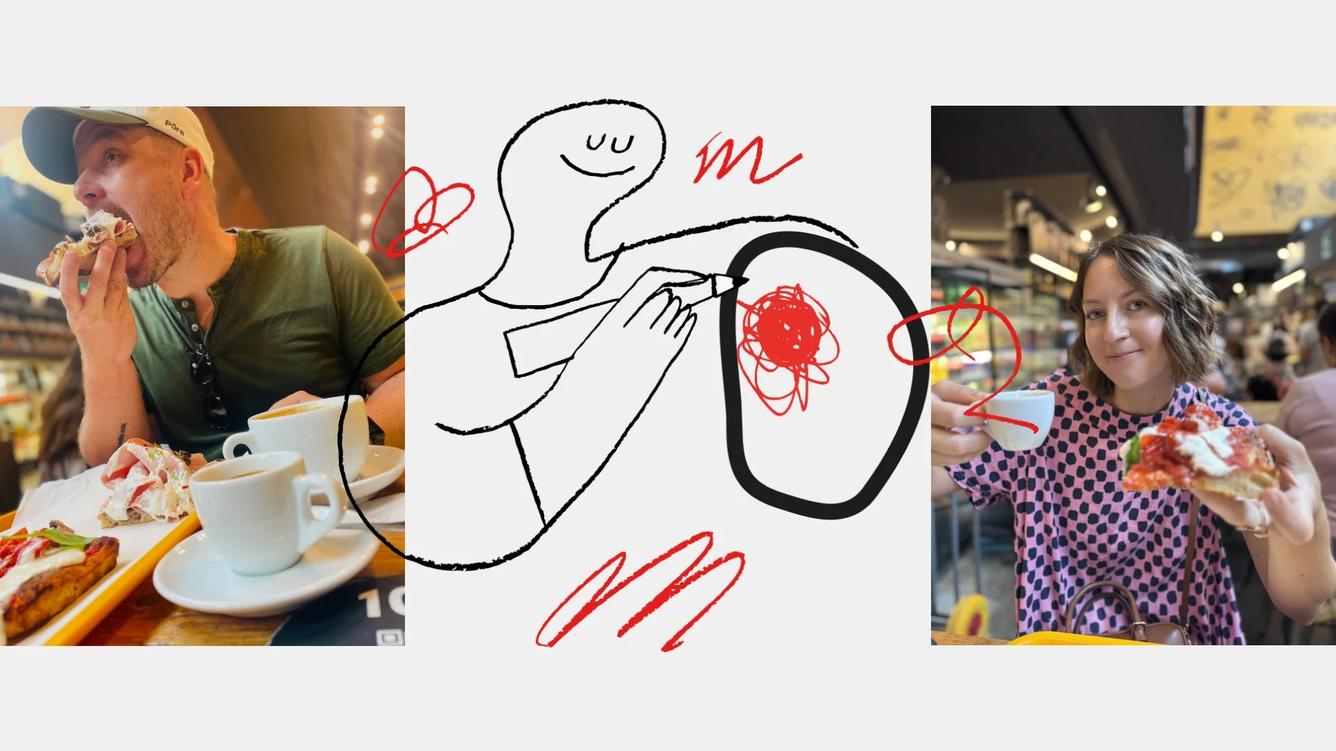
One of the better examples we encountered was Mercato Centrale Roma at Termini Station.
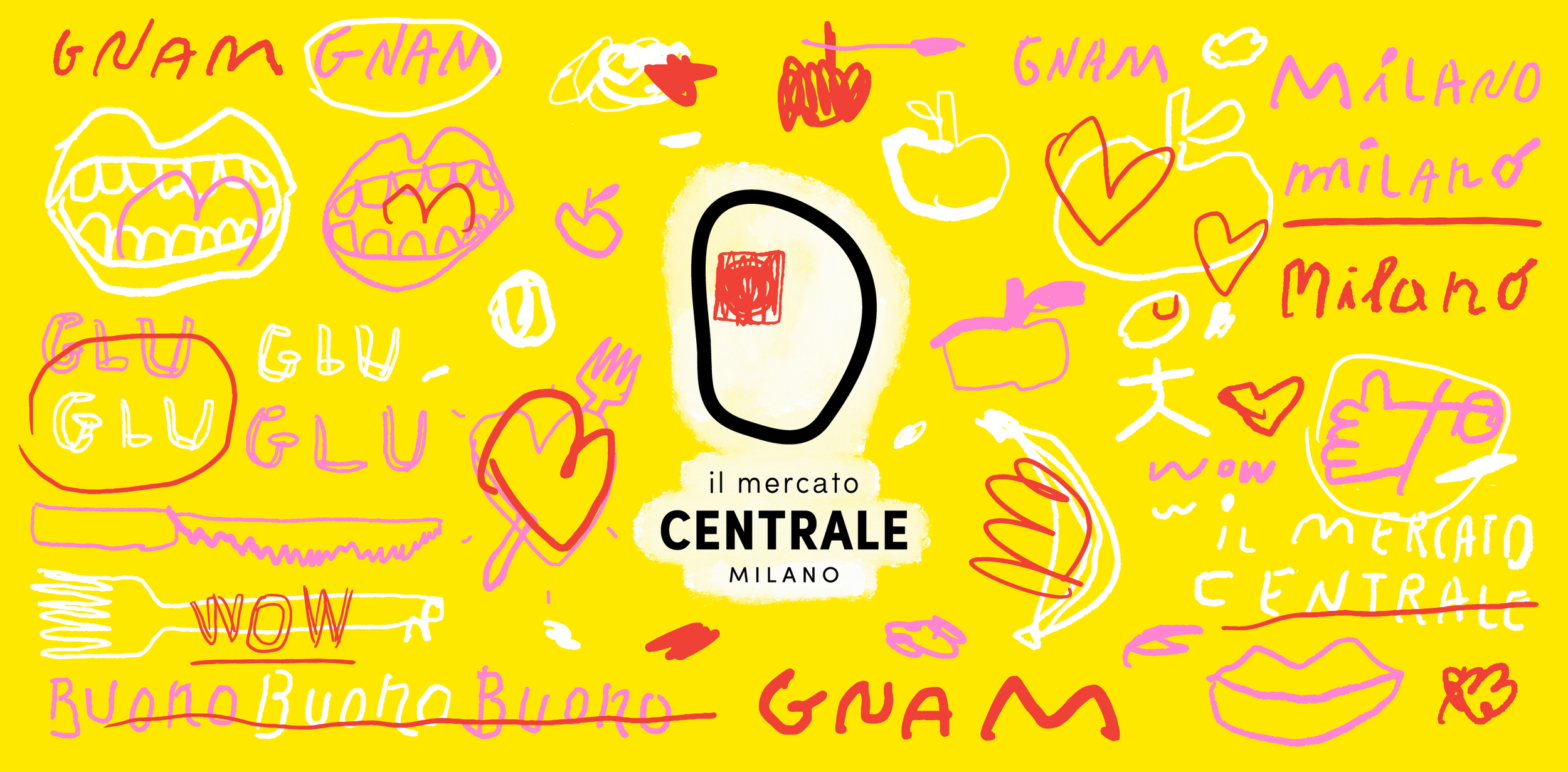
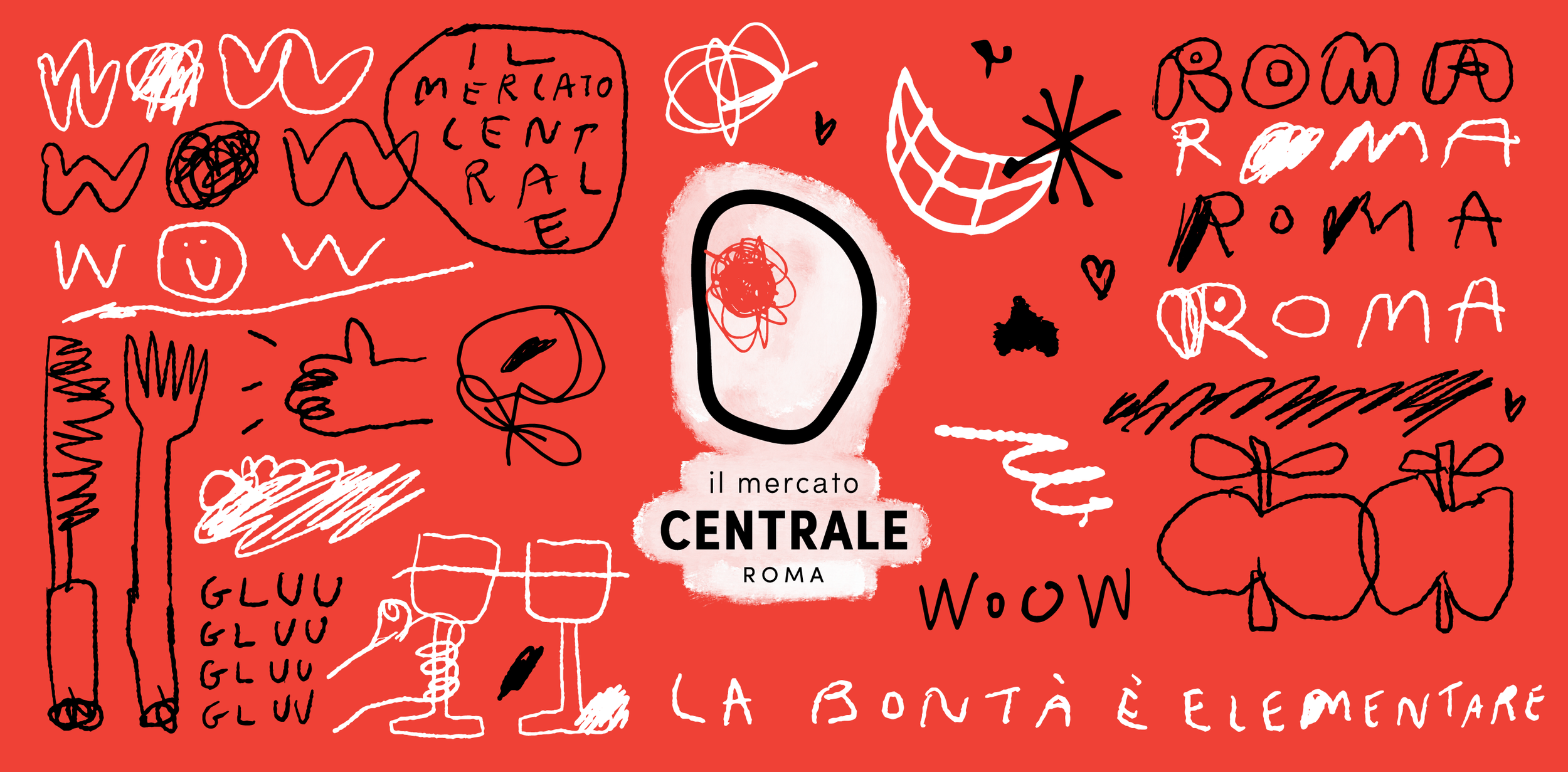
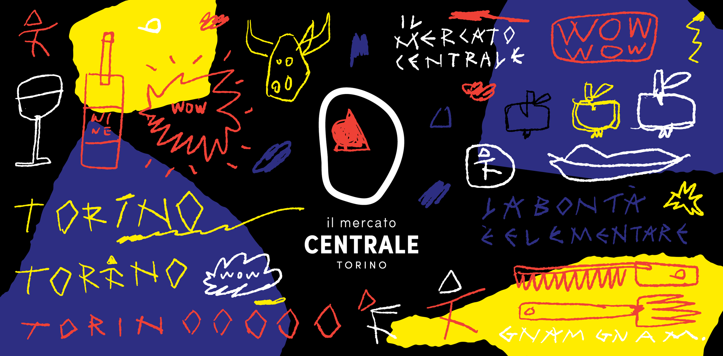
The project, developed by Florence-based design studio Almagreal, takes a very different approach from the historical visual language surrounding it. Rather than trying to imitate Rome or decorate the space with references to Italian tradition, the identity creates its own contemporary language.
The designers describe the concept around a simple idea: la bontà è elementare — goodness is elementary. The visual system uses only three colours and develops a distinctive hand-drawn "doodle" language that extends into a custom typeface, signage, illustrations, advertising, menus, uniforms and the interior environment. Almagreal
What makes the project particularly interesting is that the visual identity does not simply sit on top of the building. It becomes part of the space. The same visual language moves between signage, walls, shops, stairs, uniforms and digital communication, creating a coherent environment rather than a collection of separate graphics. Almagreal describes the project as an attempt to reduce the visual noise surrounding food communication and return to something more essential. Almagreal
It is a good example of contemporary design finding its place in a historically saturated environment without trying to compete with the city itself.
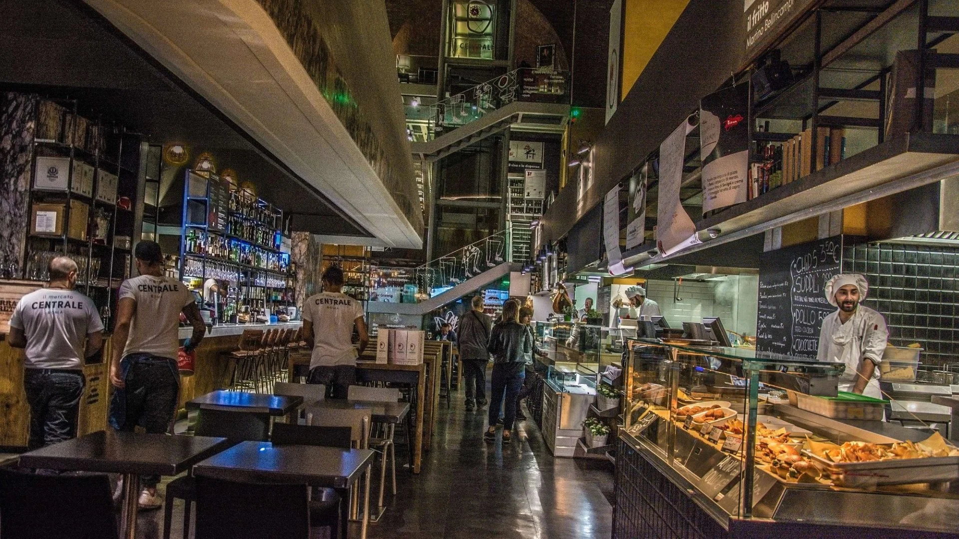
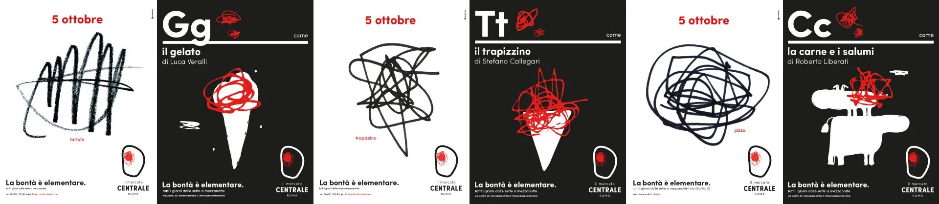
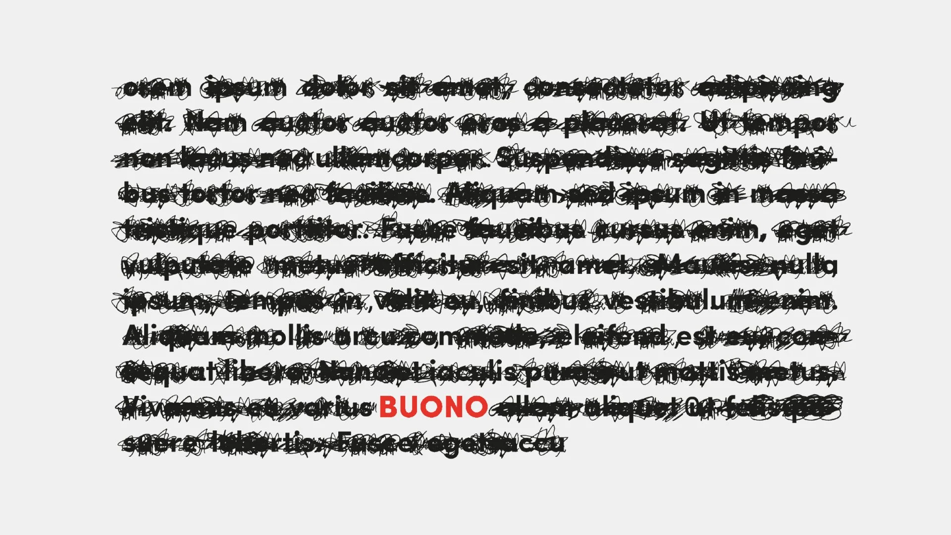
A custom typeface that has a graphic language inside (photo by Almagreal 1/2)
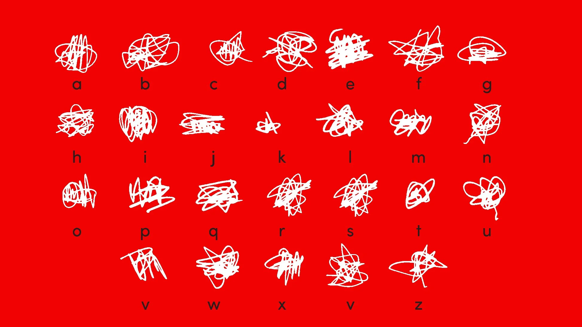
A custom typeface that has a graphic language inside (photo by Almagreal 2/2)
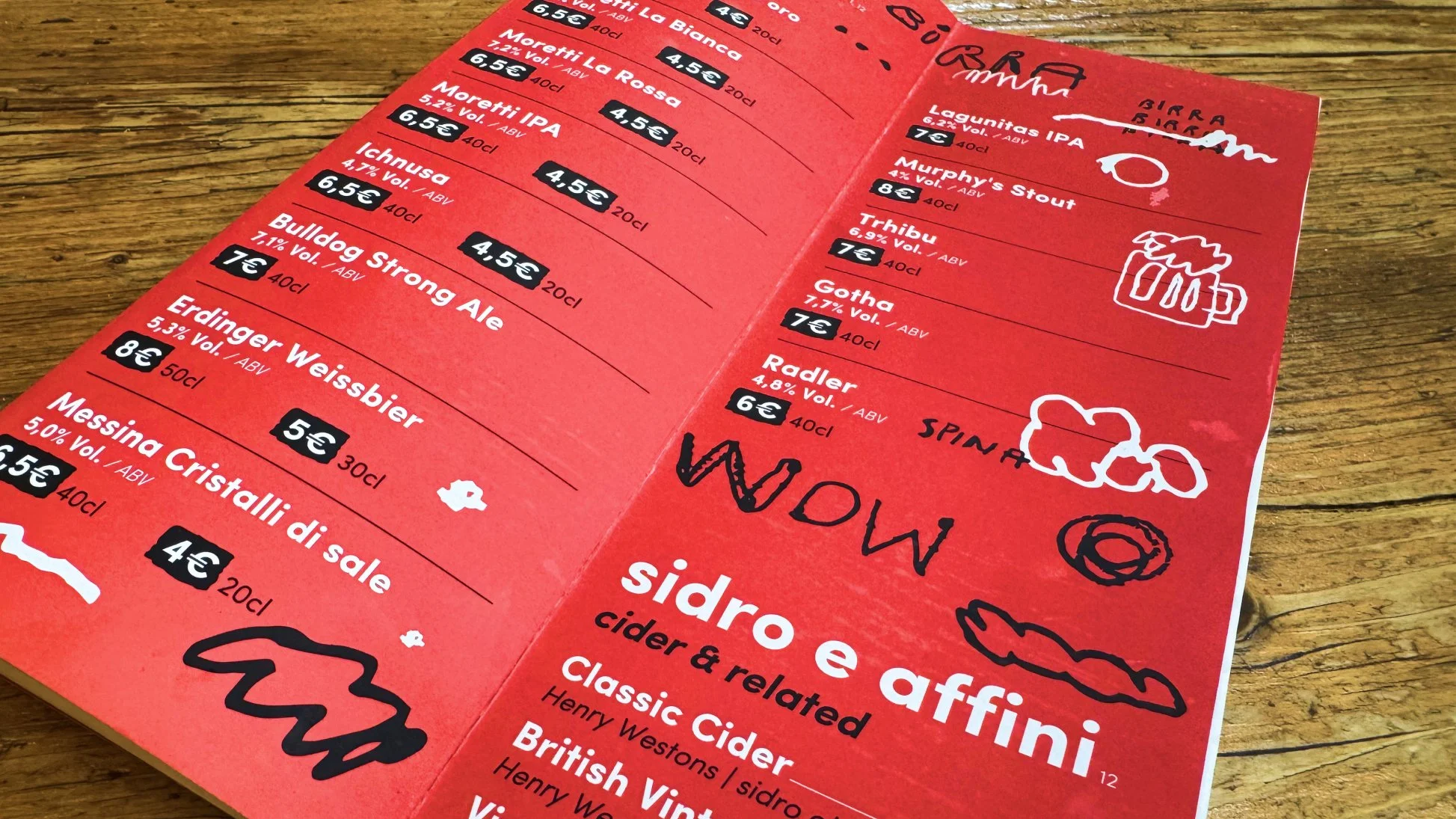
Beverage menu (photo by Erkki Pung, Sviiter Studio)
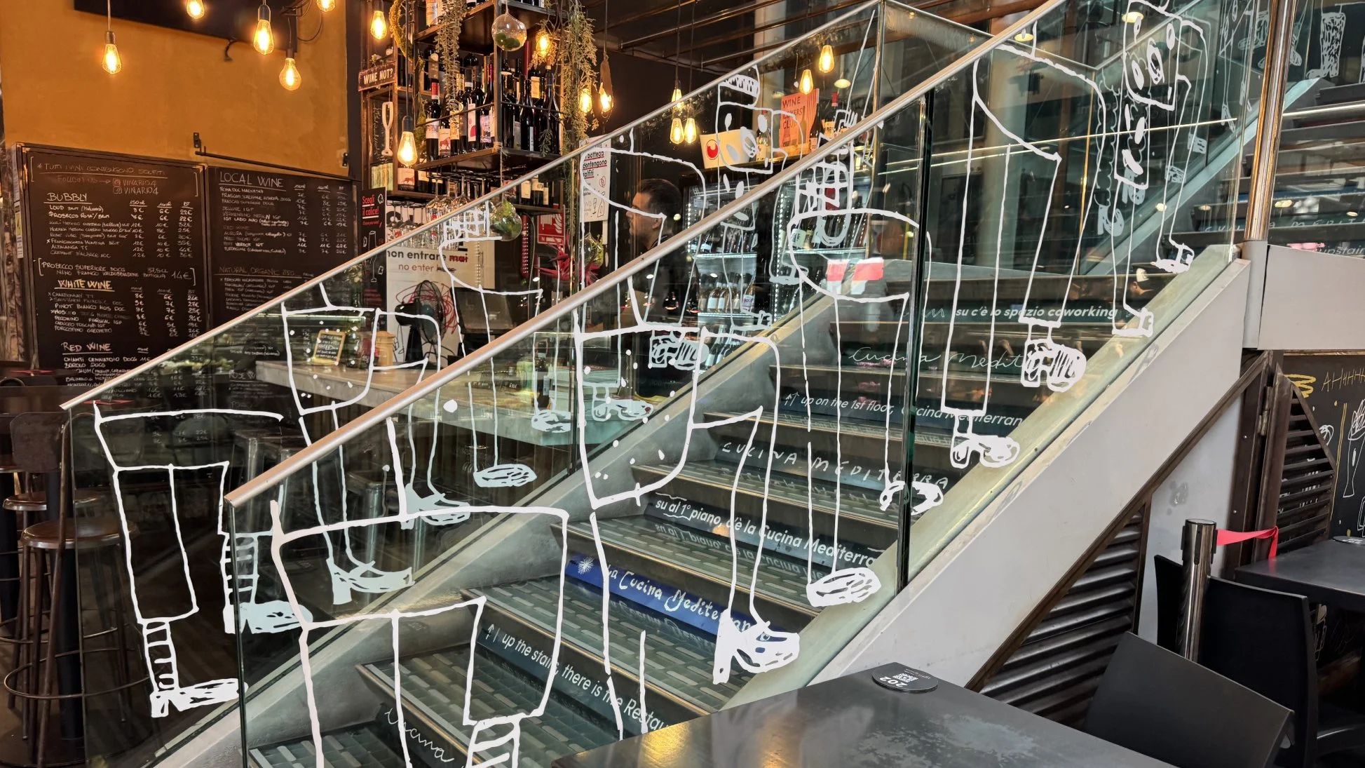
Way-finding in a sense visual communication (photo by Erkki Pung, Sviiter Studio)
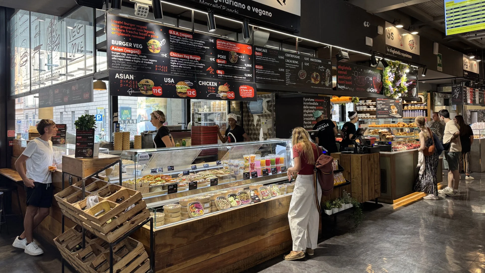
The whole concept shows that all that craziness and contemporary is well packed and understandable for multi-cultural visitors (photo by Erkki Pung, Sviiter Studio)
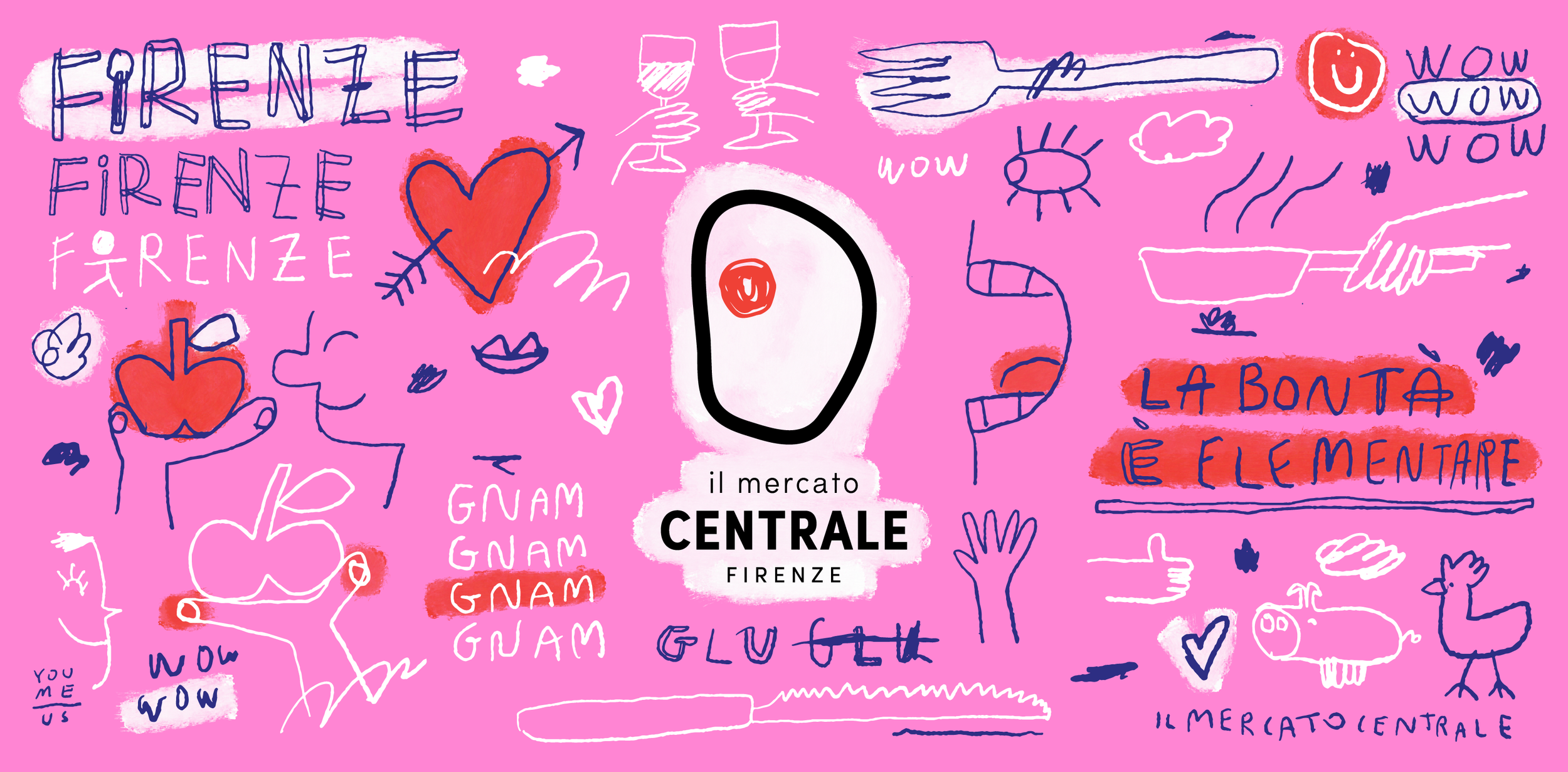
A city needs an identity, too
Rome, like any large city, also needs to communicate as an organisation.
Its civic identity is built around familiar historical symbols, colours and typography, but what is interesting is how little the city needs to do to be recognisable. The name Roma carries an enormous amount of visual and cultural meaning before a designer adds anything to it.
The official identity of Roma Capitale is deliberately restrained, with the city's heraldic symbols and a controlled typographic system providing a framework for institutional communication. The municipality maintains a formal visual identity manual covering the use of its logos and their different colour applications.
There is an interesting tension here. A city like Rome could easily be tempted to create a spectacular visual identity simply because it has so much visual material to work with. Yet the more appropriate solution may be the opposite: to create a system that knows when to be quiet.
Recent work by Italian design consultancy Inarea illustrates this idea particularly well. Their project for Comune di Roma approached the city as a brand system, combining brand architecture, identity, type design and signage and wayfinding. Rather than replacing Rome's existing historical character, the project sought to organise it into a more coherent contemporary system, including a dedicated logotype and typographic language. Inarea
That is perhaps the most interesting lesson here.
A city's identity does not necessarily need to dominate its environment. In a place as visually dense as Rome, a successful identity may be one that provides structure without demanding all the attention.
Rome’s visual communication has to operate at an enormous scale. In 2025 alone, the city recorded 22.9 million tourist arrivals and more than 52.9 million overnight stays. In that environment, signage and wayfinding are not secondary details — they are part of the infrastructure that allows a complex city to remain navigable. Wayfinding needs to be clear, transport information needs to be recognisable and public communication needs to function across an enormous number of situations — but the system also needs to leave room for the city itself.
In other words, good city branding should help you read the city rather than cover it with a brand.
The details between the landmarks
This is probably the part of Rome we enjoy most after returning several times.
Once the major landmarks become familiar, attention naturally moves elsewhere. You start noticing how a restaurant has chosen its lettering, how an old shop sign sits against a new façade, how a particular colour repeats across a neighbourhood or how an information sign attempts to compete with centuries of architectural noise.
The city becomes a kind of enormous visual archive.
This is not just a poetic way of describing it. Rome's streets contain layers of typography, materials and visual conventions that have accumulated over centuries. Even contemporary graphic designers can treat the city as a source of research.
The IED Rome graphic design programme, for example, has used Rome itself as a typographic archive, asking students to investigate the city's signage, lettering and typeforms while considering their relationship with materials, history and urban space. IED
That way of looking at the city feels particularly close to how we approach travel as designers. Instead of asking only whether something is beautiful, you begin asking why it looks the way it does, what problem it is solving, what historical references it carries and whether it actually works in its environment.
Sometimes the most interesting piece of design in Rome is not the one you came looking for.
It is the one you notice because you finally stopped looking only at the monuments.
Rome after dark
Rome does not stop when the tourist attractions close.
The city has a lively evening culture, and the streets around the centre gradually change character as restaurants fill up and people move between squares, bars and cafés. There is a different energy after sunset — less about ticking off destinations and more about occupying the city.
We also ended up visitint the cinema, at the Moderno Space Cinema on Piazza della Repubblica. It was another small reminder that even in a city defined so strongly by its past, contemporary culture is constantly being layered on top of it. Unfortunately we didn’t find any movies in English, so we did a bit window sightseeing only…
That contrast is perhaps what keeps bringing us back.
Rome does not resolve its history into one clean visual language. It allows different periods, styles and ideas to remain visible at the same time. The result is sometimes messy, sometimes excessive and occasionally contradictory — but rarely boring.
And perhaps that is exactly why it is such an interesting city for designers.
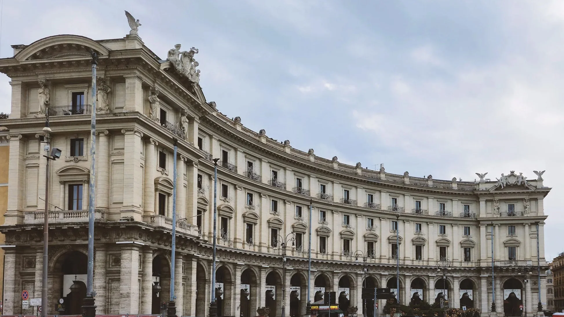
Warner’s Moderno Space Cinema (built 1907 was the first purpose built cinema in Italy)
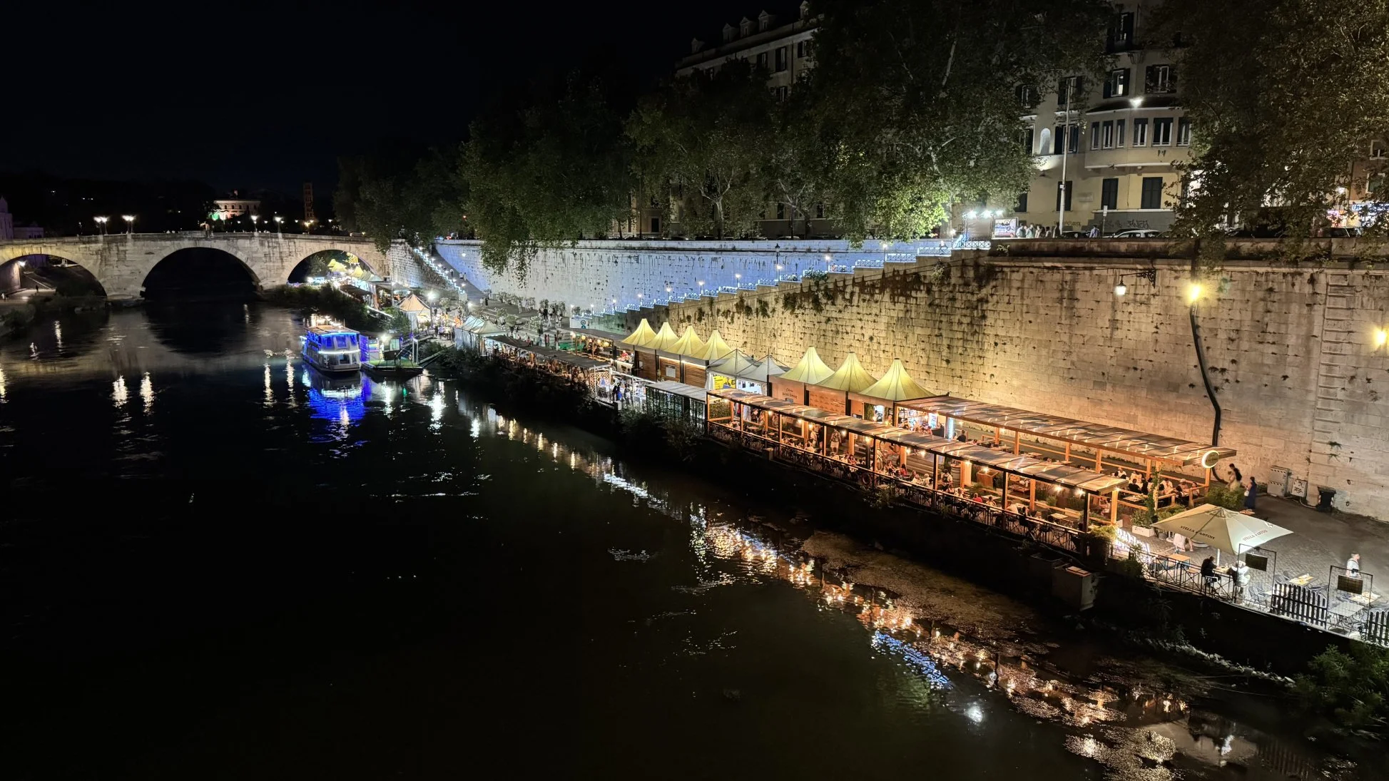
The lively and lighted-up Tiber (photo by Erkki Pung, Sviiter Studio)
Final thoughts
After several visits, we no longer feel the need to see everything in Rome. In fact, the opposite has happened. The more familiar the city becomes, the more interesting the spaces between the obvious destinations seem.
You can return to the Colosseum and see something different simply because the light has changed. You can walk through a neighbourhood because a food tour has given you a reason to go there. You can discover a contemporary identity at Termini that has nothing to do with ancient Rome, yet somehow feels completely at home in the city. Or you can spend ten minutes looking at a shop sign that you would have walked past on your first visit.
Perhaps this is what happens when travelling becomes less about collecting sights and more about paying attention.
For us, Rome remains a city of contradictions — monumental and ordinary, excessive and restrained, ancient and contemporary. Its visual identity is not something that can be reduced to a logo or a colour palette because the city itself is the identity, built layer by layer over thousands of years.
And maybe that is why we keep coming back.
There is always another layer to notice.
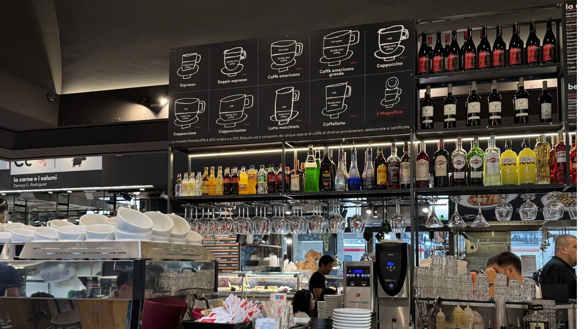
Fun fact: We learned a new trinity — Cappuccino - Cappuccione - Cappuccissimo (photo by Erkki Pung, Sviiter Studio)