All — Behind the Brand — Famous logos — News — Travels — Useful

Black — why do brands remove colour when they become more confident?
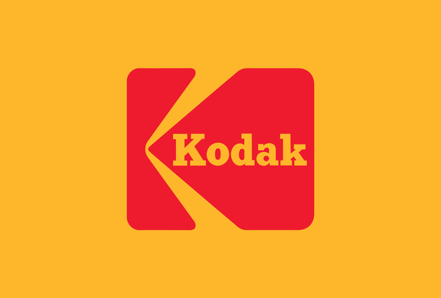
Famous logos XXIV — Kodak
Few brands have shaped the way we remember the world as profoundly as Kodak. For more than a century, the company was synonymous with photography itself. Family holidays, birthdays, weddings and historical events were captured through Kodak film, making the brand part of both personal and collective memory.

Behind the brand — Triathlon Cafe Club
The story of Triathlon Cafe Club began in 2021 as a collaborative vision between Sviiter Studio and Stanislav, an enthusiast deeply rooted in the worlds of cycling and triathlon. Initially conceived in Estonia as a straightforward online retail platform, the brand quickly realised that the community required more than just equipment; it needed a physical home. This realisation led to the establishment of the first Triathlon Café in Montenegro, a pioneering hub that integrated a specialty coffee experience with retail and a dedicated bike workshop.

When design does not solve the problem?
Design is frequently seen as a solution, yet many problems it is asked to solve originate elsewhere. This article examines the difference between clarity and definition, and why design works best when it translates well-defined ideas rather than compensating for their absence.
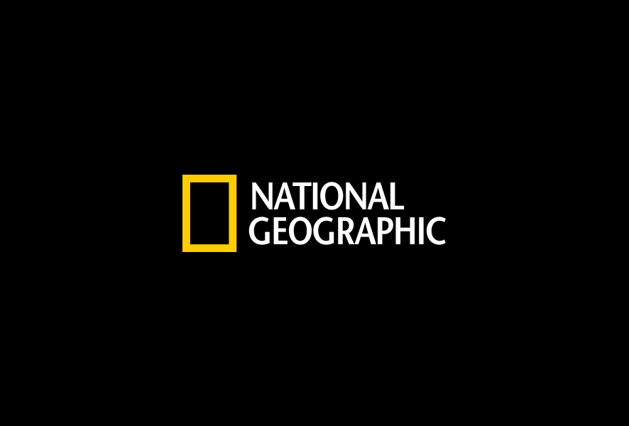
Famous logos XXIII — National Geographic
The story behind the National Geographic visual identity and its iconic yellow frame. Discover how a simple design element became one of the most recognisable symbols in editorial design.
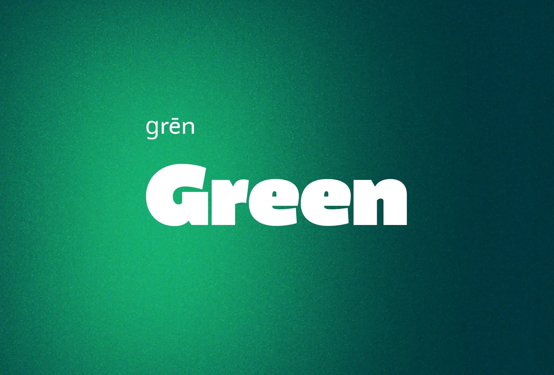
Green — the colour of balance, responsibility and time
Green is one of the most demanding colours in branding. Explore how green builds trust, supports systems and why it requires responsibility in visual identity design.
Typography as a silent salesperson
Good typography does not ask for attention — it builds trust and clarity. Why type is one of the most powerful tools in visual identity and how it quietly influences decisions across every channel.
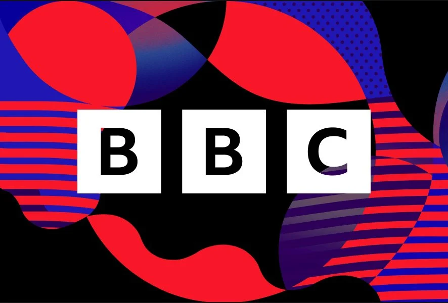
Famous Logos XXII — BBC
BBC’s visual identity didn’t evolve through constant logo changes, but through one decisive shift in 1946 — from mark to system. What organisations can learn from a brand built on structure, not reinvention.

Visual identity is not cosmetic — it’s a leadership decision
Most visual problems are not design problems but decision problems. Why visual identity and CVI are leadership tools, not cosmetics — and how clarity creates consistency as companies grow.

Designers after AI — less execution, more decisions
AI won’t replace designers — just like digital cameras didn’t replace photographers. What changes is the role: less execution, more thinking. Less form, more decisions. Good design has never been about tools. It’s about responsibility, context and long-term value.
Sviiter Studio — 2025 year in review
Once again, the end of the year gives us a reason to pause and look back at what has passed through our table.
2025 was a year of steady work, structural change and quiet growth. One of the most significant shifts this year was the volume of subcontracting projects. While much of this work cannot be publicly shown, the overall workload led us to slightly expand our team — a natural step forward after a year of sustained intensity and trust from long-term partners.

Red — energy, power and emotion
Red is energy, passion and courage. From Coca-Cola and Ferrari to Nintendo and Netflix – discover why red drives attention and emotion in branding.

Pantone Color of the Year 2026 — Cloud Dancer
Pantone has announced Cloud Dancer as the Color of the Year 2026 — a tone that combines silence, spaciousness and remarkable clarity. Pantone describes it as a colour that clears the visual field, creates space to breathe and opens room for something new. It is soft and neutral, yet quietly confident.

Famous Logos XXI — Spotify
A deep dive into the evolution of Spotify’s visual identity, colour system, UI accessibility considerations and brand culture.

Blue — why this colour is the most trusted choice in branding?
Blue is the world’s most widely used branding colour. From IBM and Samsung to Nivea and IKEA, discover why it symbolises trust, professionalism, and innovation across industries.

Famous logos XX — Otl Aicher
Otl Aicher was born in Ulm, Germany, in 1922. Growing up in a politically turbulent time, he refused to join the Hitler Youth and even spent part of his youth in hiding. After the war, he studied sculpture and design at the Academy of Fine Arts in Munich, but his most important contribution would come not from his formal education but from his vision of design as a tool to rebuild and reimagine society.
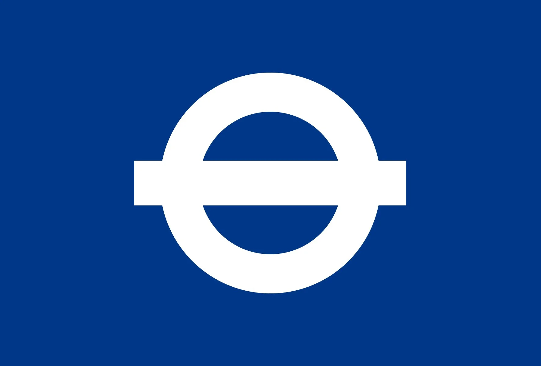
Famous Logos XIX — Transport for London
When we consider the world’s most recognisable logos, corporate giants like Coca-Cola or Apple often spring to mind. Yet, some of the most influential symbols emerge not from boardrooms, but from the streets — clear, functional, and embedded in daily life. Few logos exemplify this better than London’s iconic roundel, the emblem of public transport that has silently shaped the city’s identity for over a century.
The evolving design market: navigating challenges and opportunities
The design industry is experiencing profound changes. For decades, traditional design studios have operated with stable processes, long project cycles, and well-established client relationships. These methods, while reliable in the past, are increasingly challenged by a market that demands speed, flexibility, and adaptive solutions. Clients now expect agile responses to evolving business needs, tighter deadlines, and solutions that integrate seamlessly with their strategic objectives. This shift has created a landscape where smaller studios and freelance designers can compete effectively, offering nimble, focused services that larger, more rigid studios often struggle to provide.

Why typography matters in visual identity?
Typography is more than just letters on a page — it's a fundamental element that shapes how a brand is perceived. It sets the tone, communicates values, and ensures consistency across all visual outputs. A strong typographic system not only looks good — it speaks directly to the audience.
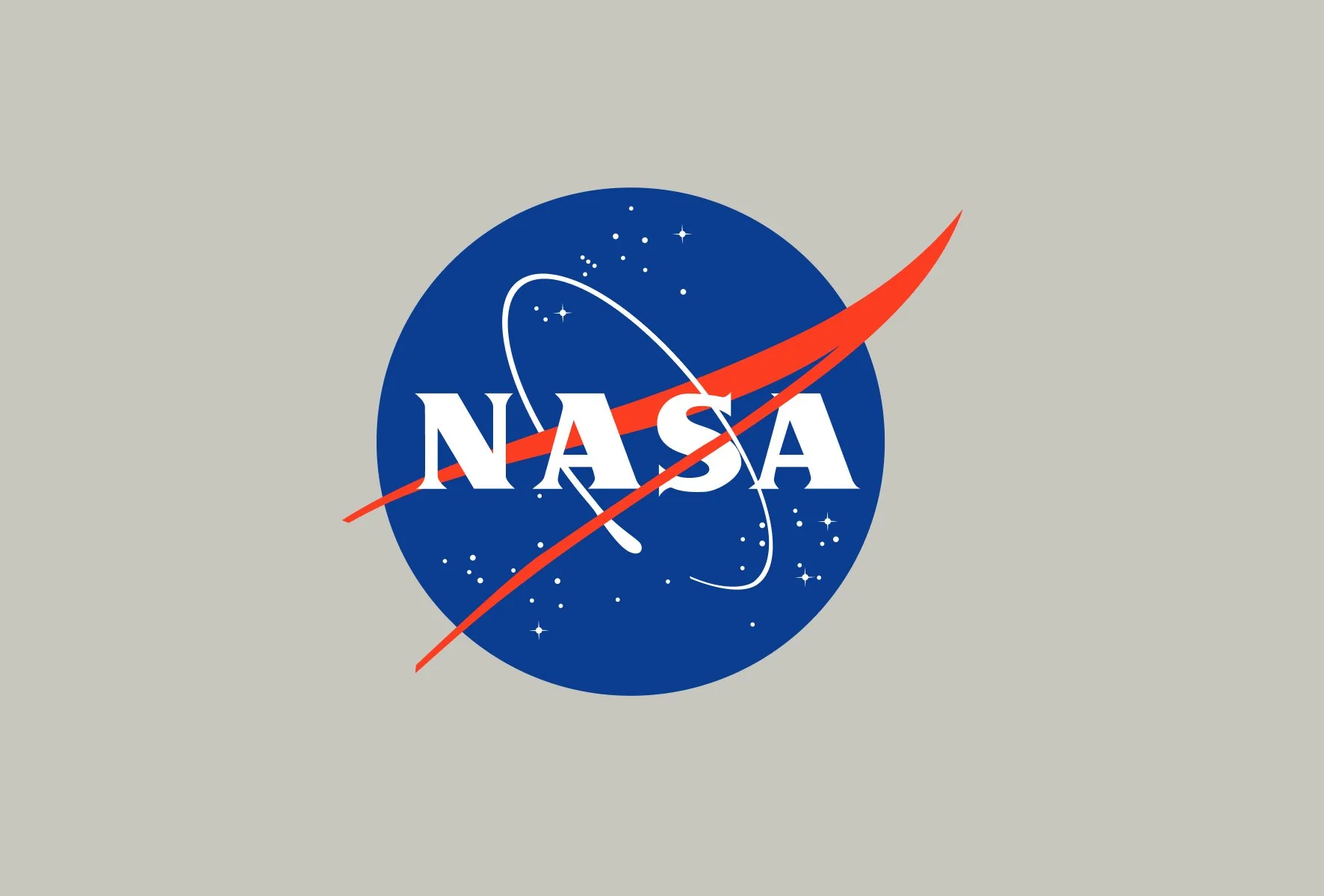
Famous Logos XVIII — NASA
When we think of iconic logos, few reach the stratospheric recognition of NASA. Founded in 1958, the National Aeronautics and Space Administration quickly became a symbol not just of American innovation, but of humanity's quest to explore the unknown. Its visual identity has evolved alongside its missions, capturing shifts in technology, public sentiment, and even political context.