Sviiter Studio — 2025 year in review
Once again, the end of the year gives us a reason to pause and look back at what has passed through our table.
2025 was a year of steady work, structural change and quiet growth. One of the most significant shifts this year was the volume of subcontracting projects. While much of this work cannot be publicly shown, the overall workload led us to slightly expand our team — a natural step forward after a year of sustained intensity and trust from long-term partners.
Visual identities
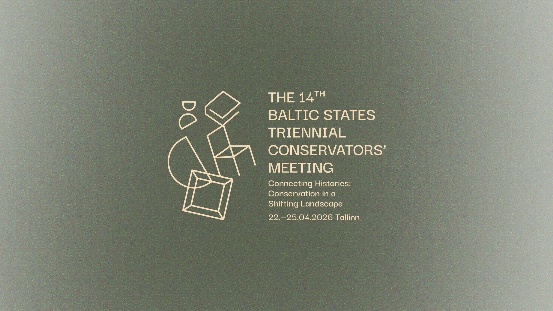
This year, we created the visual identity for the 14th Baltic Conservators’ Triennial, commissioned by the Estonian Association of Conservators. The identity bridges past and future, valuing the essence of objects, material culture and the preservation of history — themes that strongly guided both the concept and the visual language. Read more about the project.
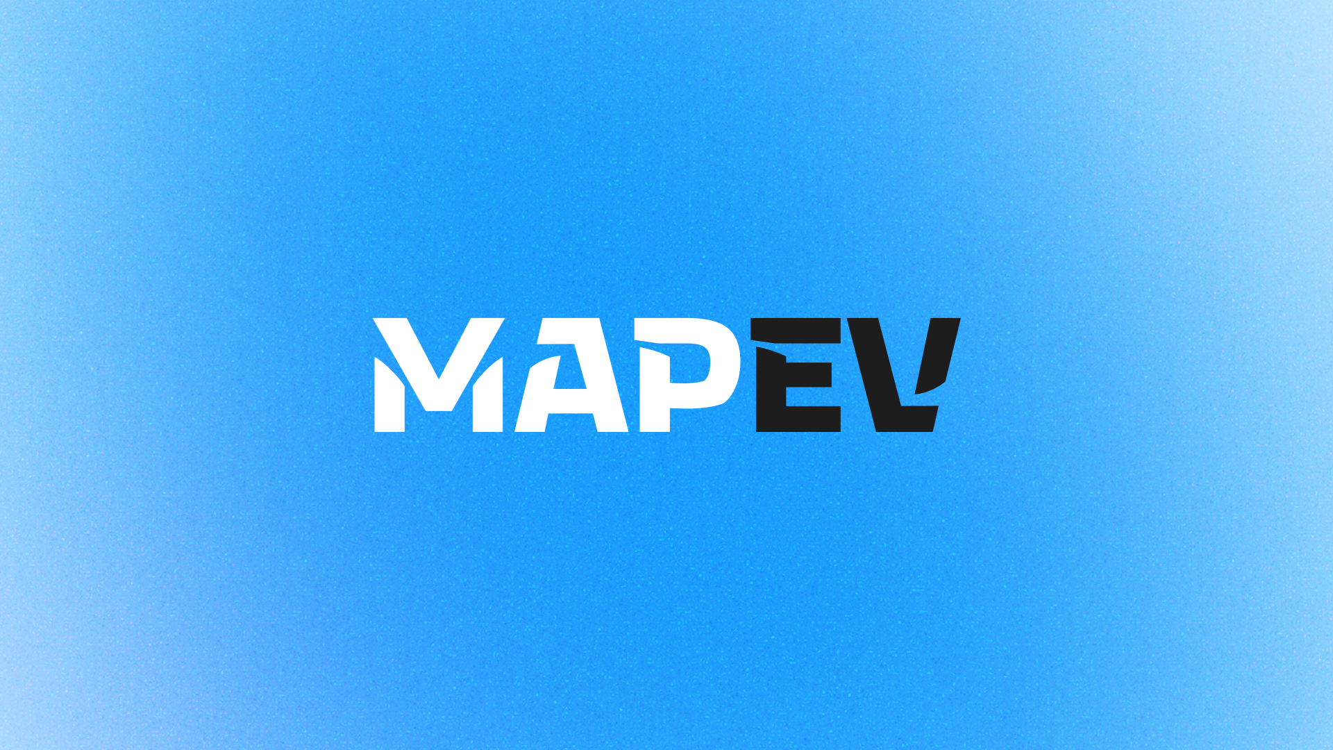
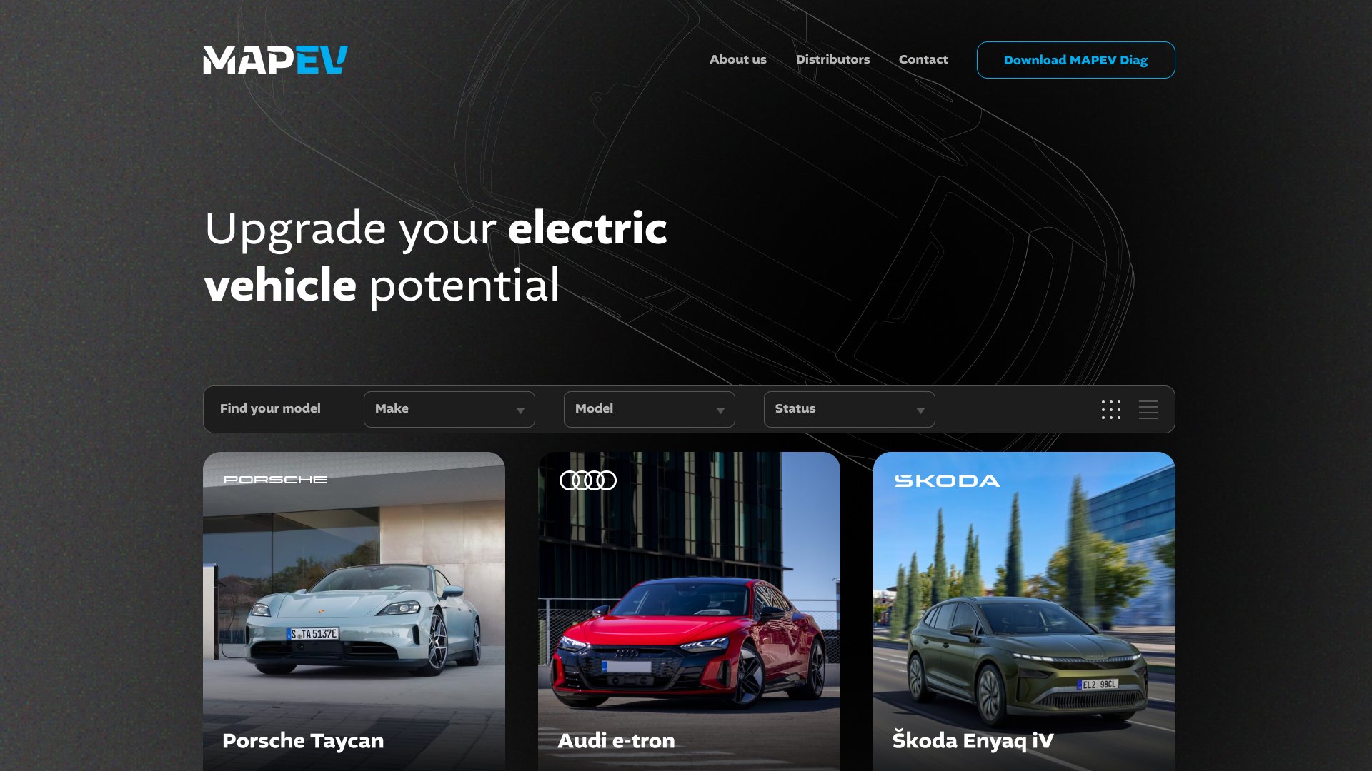
MapEV is a service focused on electric vehicle chip solutions, giving cars extended capabilities through smart software and hardware integration. The identity reflects technological clarity and forward-looking precision.
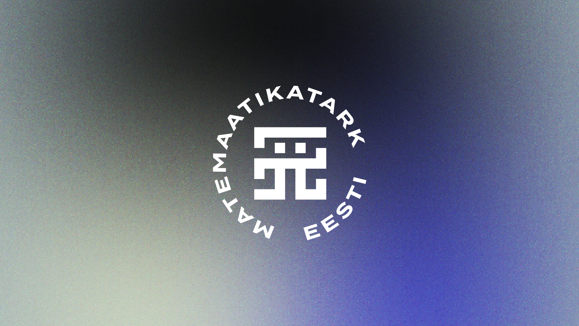
Math-wise Estonia is an initiative aimed at popularising mathematics in schools. Its visual identity is built around a character derived from the symbol π, combined with a strong blue-black-white colour palette, grounding the concept firmly in local cultural context. Read more from www.matemaatika.ee.
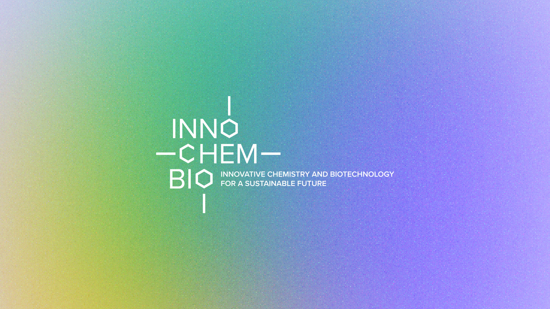
The visual identity for INNOCHEMBIO is a doctoral programme led by TalTech, focusing on sustainable chemistry and biotechnology. The programme brings together academic research and industry collaboration to develop solutions addressing climate neutrality, environmental challenges, and future-oriented technologies. Its international scope and interdisciplinary nature are reflected both in its content and in the way the programme communicates its mission visually.
Websites
Alongside new work, we also updated and expanded several existing digital projects, including Leanest, Virumaa Museums, Smart MasterKey, and others.
Through subcontracting partnerships, we delivered a total of fourteen web solutions this year — slightly more than one per month — a pace that demanded consistency, focus and reliable workflows.
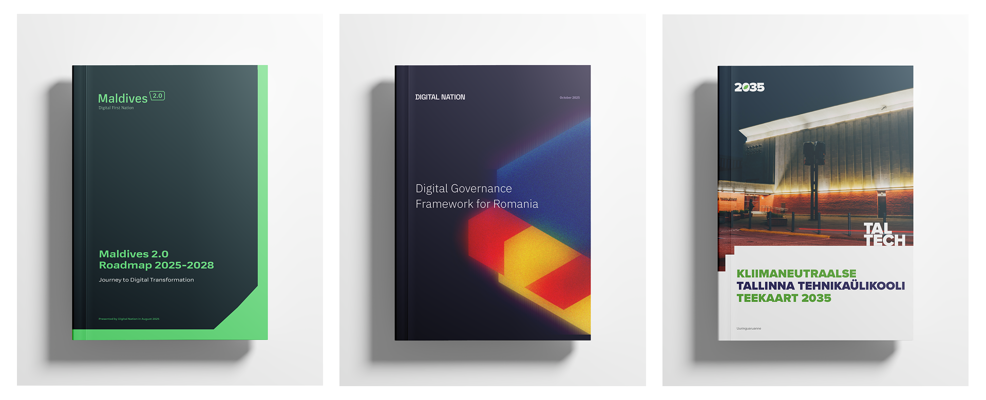
Print projects remained an important part of our work. Among the highlights were the roadmap for a climate-neutral Tallinn University of Technology by 2035, the Maldives 2.0 Roadmap 2025–2028 for digital transformation commissioned by the Government of the Maldives, and the Digital Governance Framework for the Romanian Government. We also produced an Arabic-language catalogue for Bon Vegan, adding another layer of linguistic and typographic complexity to the year.
Packaging
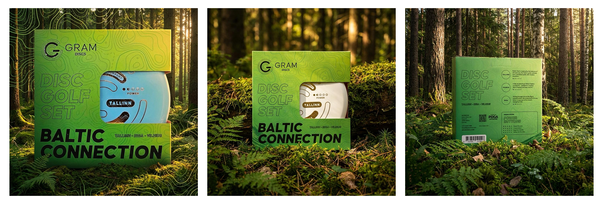
Despite packaging being one of the most time-consuming design areas, we managed to deliver several meaningful projects. These included a refreshed vitamin D nutritional yeast package for Bon Vegan, a gift box created specifically for the UAE market, and Gram Discs’ Baltic Connection three-disc set.
Events
For the European Disc Golf Festival, we were part of the design task force, ensuring that all visuals were consistently applied across banners, courses, fences and sponsor materials. The goal was clarity, visibility and correct brand representation across a large-scale, fast-moving environment.
Other projects
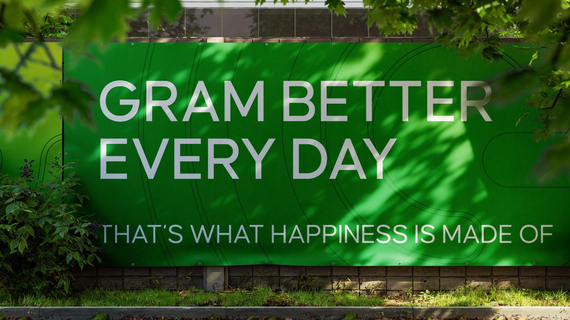
Gram Discs expanded its brand beyond energy drinks into disc golf equipment. We developed the visual logic for the discs and designed the full disc series. Since the brand was introduced publicly at the European Disc Golf Festival, we also created the complete visual package for their sponsored course area.
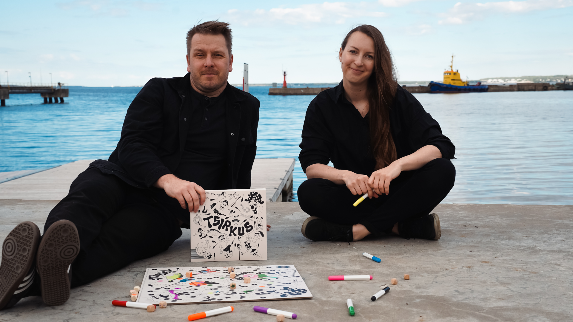
Another long-term effort finally came to life with the Colorable Circus board game. A classic at heart, the game combines a colouring book and a board game, allowing players to colour the board and pieces before playing. It has proven unexpectedly popular and is now available through our online store, Tsirkusepood, and Rahva Raamat bookstores across Estonia.
Blog
Our blog took a significant step forward this year. We launched a new category, Behind the Brand, where we give the floor to companies we’ve worked with and ask how they perceive and apply their visual identity in practice.
Our Famous Logos series continued to grow, with six new stories added this year, bringing the total to twenty-one logo stories. Under the Useful category, we also introduced a new colour series. So far, two articles — Blue and Red — have been published, exploring the nature of colour through well-known brands and their strategic choices.
In progress
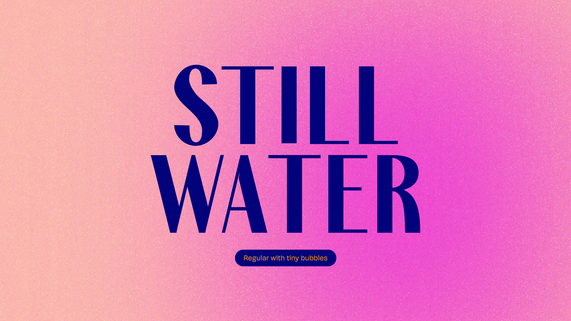
One of our long-term internal projects, the Still Water typeface, was initially planned for release before the end of the year. However, it needs more time. We prefer to release it with full confidence rather than rush something that deserves patience and care.