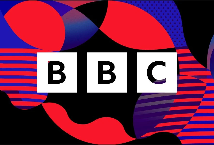
Famous Logos XXII — BBC
BBC’s (British Broadcasting Corporation) visual identity is often discussed through the lens of logo changes. Timelines and galleries show multiple versions, suggesting a brand in constant visual flux. In reality, the opposite is true. BBC’s identity story is not about repeated reinvention, but about one decisive moment — and the discipline to stand by it. That moment came in 1946.
Before the system: a logo for linear media
BBC’s early logos reflected the logic of their time. Rounded forms, intertwined letterforms and decorative typography were well suited to a media environment that was linear, limited in output and largely static. The logo functioned as a mark — a symbol identifying the organisation — rather than a system designed to operate across multiple contexts.
At that stage, there was no need for modularity or scalability. The identity did not need to adapt to dozens of formats or channels. It simply had to be recognisable and appropriate to its era.
BBC logo evolution from 1922 to 1960 — the era of linear media
1946 — the point where a logo stopped being enough
The change introduced in 1946 was not a stylistic refresh. It was a conceptual shift. The ornamental mark was replaced with a structured solution in which the letters were separated and placed into boxes. This was the first time BBC’s logo began to behave as a building block rather than a decorative element.
The introduction of boxes was not merely a visual decision. It established a logic. The mark became modular, repeatable and independent of context. More importantly, it created the conditions for a visual identity that could function even when the logo itself was not central.
This is where BBC’s identity truly emerged — not gradually over decades, but decisively, at the moment the organisation recognised that a mark alone could no longer carry the whole.
BBC logo evolution from 1958 to present — the modular era
Refinement, not reinvention
Everything that followed — changes to corner radii, typographic refinements, proportional adjustments — has been technical and contextual rather than strategic. These updates responded to new technologies, new platforms and new viewing conditions, without altering the underlying logic of the identity.
This is where many “logo evolution” timelines become misleading. When viewed superficially, each visual adjustment can appear to be a new identity. In reality, these are refinements of the same system. Rounded versus sharp corners is a detail-level decision. The existence of a system is the strategic one.
BBC did not repeatedly redefine its identity. It allowed it to mature.
Typography as the backbone of the system
Typography plays a central role in BBC’s visual language. The Reith typeface was not designed to impress, but to endure. It is readable, neutral and robust across a wide range of environments — qualities far more important to a system than visual flair.
If the logo functions as a signature, typography becomes the voice. It allows the identity to remain recognisable even when the logo is absent or deliberately understated. This is how a visual language sustains itself beyond a single mark.
Identity as behaviour, not decoration
BBC’s identity extends far beyond static graphics. Motion, rhythm, transitions and sound all follow the same internal logic. Visual identity here is not an image, but behaviour. Each decision is governed by structure rather than taste.
This approach enables BBC’s identity to operate consistently across platforms, audiences and content types. The system does not force everything to look the same — it ensures everything belongs to the same language.
What organisations can learn from BBC
BBC is not a strong example because it is a media organisation. It is strong because it is large, fragmented and constantly evolving — much like many contemporary organisations.
As channels multiply, systems must become stronger. The more content an organisation produces, the less room there is for improvisation. A well-defined visual identity does not restrict creativity; it enables it by removing unnecessary decisions.
This is where visual identity and CVI become management tools rather than design artefacts. They prevent fragmentation, reduce repetitive debate and ensure that growth does not dilute recognition.
Identity as a decision, not an object
BBC did not set out to create a “beautiful logo”. It created a system that allows thousands of people to make daily decisions without needing to ask what something should look like.
Identity is not an object. It is an agreement — a decision about how an organisation presents itself, behaves and endures over time.
That is why BBC’s identity still works today. Not because it has constantly changed, but because it made the right decision at the right moment — and stayed with it.
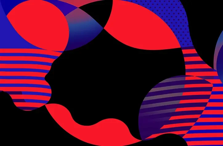
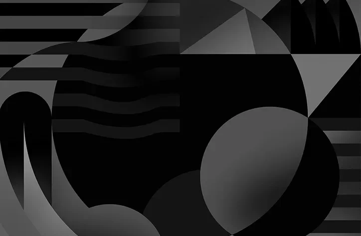
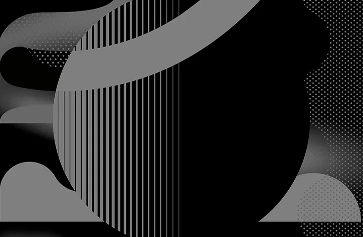
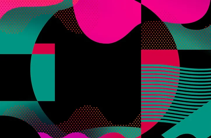
Here you’ll find a small section of graphic elements, backgrounds and advertising samples for BBC Radio on, created by Mother Design.

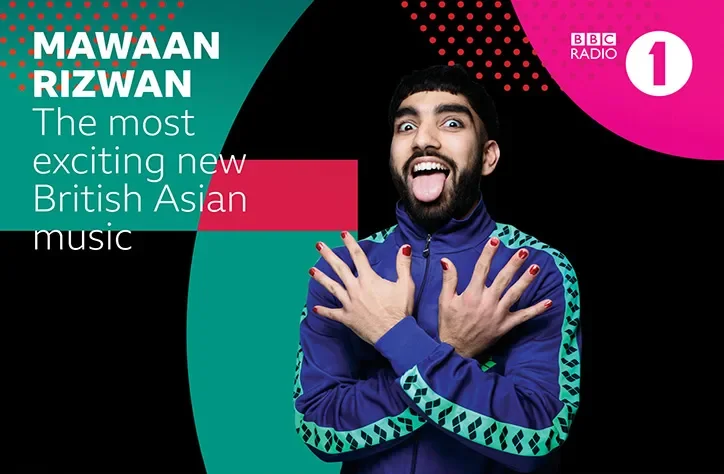
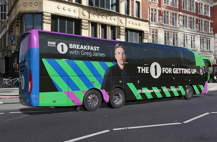
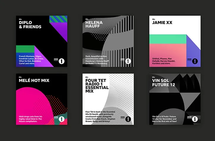
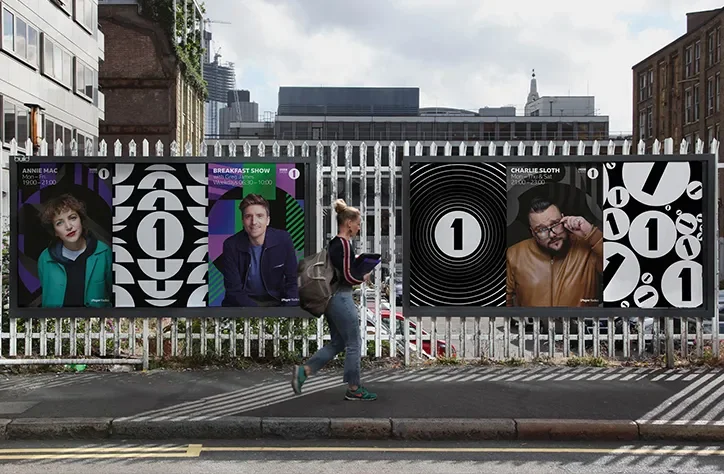
“We needed to create a consistent approach to using BBC Reith font across all applications and sub-brands, as well as develop a graphic language that brought cohesion and united everything,”
Credits: BBC Branding, BBC Creative, It’s Nice That, Mother Design, Dalton Maag.