Famous Logos XXVI — David Bowie
There are artists whose names become recognisable long before you hear their music. Sometimes it is a symbol, sometimes a particular typeface, a colour, a photograph or simply a way of presenting themselves that becomes so familiar that the visual identity starts to exist independently from the work itself.
David Bowie belongs to a much smaller group. His visual identity was never really one identity.
Across more than five decades, Bowie repeatedly changed his appearance, his characters, his typography, his photography and the visual language surrounding his music. Ziggy Stardust looked nothing like the Thin White Duke. The theatricality of Aladdin Sane belonged to a different world from the stark visual language of Blackstar. Yet these transformations did not make Bowie less recognisable. In many ways, they made him more so.
This raises an interesting question about identity: does consistency always mean looking the same?
For a traditional corporate brand, consistency is usually considered one of the foundations of recognition. A logo, colour palette, typeface and visual language are repeated across applications until the combination becomes familiar. We explored a similar idea in our article on Vignelli and the idea of identity as a system: the strength of an identity does not necessarily come from one individual element, but from the relationship between all of them.
Artists operate under a different set of conditions. Their work is expected to develop, their audience grows and changes, and their public persona can itself become part of the creative output. For an artist, remaining visually identical for twenty years may actually communicate the opposite of what the music is trying to say.
Bowie understood this unusually well.
The identity was never the costume
It would be easy to describe Bowie simply as an artist who reinvented himself. The phrase has been used so often that it risks making something much more interesting sound almost routine.
Bowie was not merely changing clothes or adopting new hairstyles. He was constructing characters, and those characters gave different periods of his career their own internal visual logic. Ziggy Stardust was not just a costume. The lightning bolt was not just make-up. The typography, photography, stage presence, clothing, album artwork and performance all contributed to the same fictional world.
That distinction matters because a visual identity becomes considerably more powerful when the individual elements are not designed independently. The photograph does not simply illustrate the music. The album cover does not simply contain the title. The typeface does not merely make the name readable. Each element reinforces the same idea from a different direction.
Bowie's visual language therefore worked less like a corporate identity manual and more like a universe.
This is perhaps why so many images from his career remain recognisable even when his name is removed. The lightning bolt can point towards Aladdin Sane. A particular suit, pose or colour combination can evoke Ziggy. The stark black-and-white imagery of Blackstar immediately belongs to another period. Recognition comes not from a single permanent mark, but from a collection of associations built over time.
In that sense, Bowie offers an unusual definition of consistency. The consistent element was not the appearance. It was the intention behind the transformation.
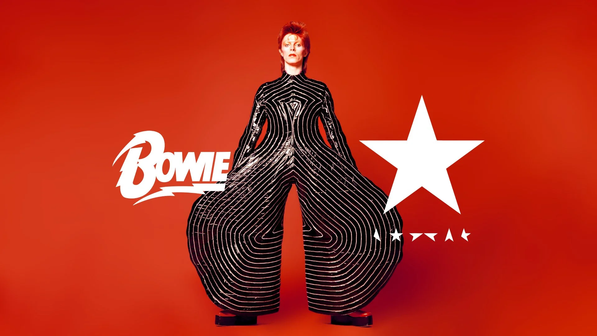
David Bowie logos on the album covers Diamond Dogs (1974), Blackstar (2016) and one of his most iconic outfits, presented in Aladdin Sane tour (1973) influenced by Japanese Kabuki theatre.
When change becomes the identity
There is a temptation in branding to treat change as something that needs to be controlled. We talk about consistency, recognition and visual equity, and quite rightly so. But there is another kind of brand where change itself becomes part of what the audience expects.
Bowie made transformation predictable.
His audience did not necessarily know what the next version of Bowie would look like, but they had learned to expect that there would be a next version. The anticipation became part of the relationship between artist and audience.
This is where his approach becomes particularly relevant to contemporary personal brands. An artist does not necessarily need to decide between being consistent and being experimental. The more interesting challenge is to establish what can change and what should remain recognisable.
The Rolling Stones provide an almost opposite example.
Their famous Tongue and Lips symbol, created by John Pasche in 1970 (redesigned and trademarked by Craig Braun), became one of the strongest visual signatures in popular music. It has appeared across album covers, posters, tickets, clothing, stage graphics and merchandise, often without requiring the band's name alongside it. Its power comes partly from repetition: the symbol has been allowed to accumulate recognition through decades of use.
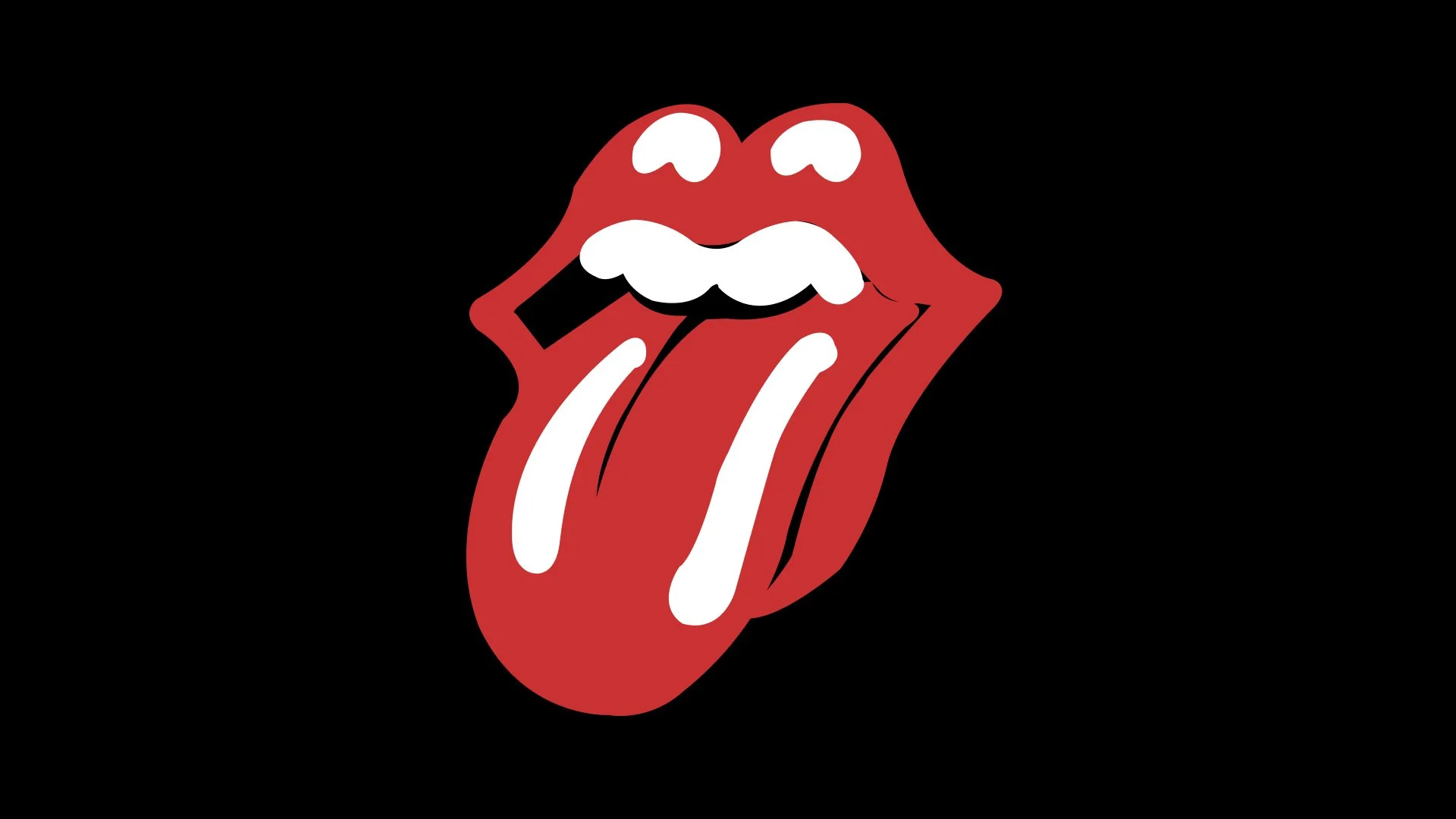
Tongue and Lips logo, originally designed by John Pasche, redesigned (current) and trademarked by Craig Braun in early 70s.
Bowie and the Rolling Stones therefore demonstrate two very different ways of building recognition. One can be built through a symbol that remains remarkably stable. The other can be built through a creative identity that constantly changes.
Neither approach is inherently better.
The important question is whether the visual decisions are connected to something people can recognise.
A logo can be a doorway
This also changes the way we should think about the word "logo" in music.
An artist's logo does not necessarily have to carry the entire burden of recognition. In some cases, a distinctive wordmark is enough. In others, a separate symbol becomes useful because it can live independently on a record sleeve, a guitar case or a T-shirt.
The logo is only one part of the experience.
For an artist, the visual identity can extend from the smallest digital application to something as physical as a vinyl record. It can exist in a Spotify thumbnail, on a concert poster, in a press photograph, across social media, on stage screens and on merchandise. These are very different environments, yet audiences increasingly encounter them as one continuous identity.
When almost every song can be accessed instantly and almost every image exists on a screen, a physical object can carry a different kind of value. A vinyl record, a carefully produced poster or a piece of merchandise is no longer simply another place to put a logo. It becomes something that allows the audience to take a fragment of the artist's world with them.
The difference between an ordinary piece of merchandise and something people actually want to keep is rarely the size of the logo. It is whether the object feels as though it belongs to the same world as the music.
Bowie's record sleeves are useful examples because they were never treated as neutral containers. Photography, typography, art direction and format helped establish what each album was before the record was even played.
The visual experience prepared the audience for the musical one.
The artist as a visual world
This becomes increasingly important now that artists have more ways to communicate than ever before.
An artist can release a song on a streaming platform, announce it through Instagram, perform it on YouTube, sell a limited vinyl edition, appear in an editorial shoot and then take the same visual language onto a festival stage. None of these platforms existed in their current form when Bowie started his career, but the underlying challenge is remarkably familiar.
How do all these fragments still feel as though they belong to the same person?
This is where the idea of personal branding becomes more interesting than simply putting a face and a logo everywhere.
A personal brand does not have to mean turning a person into a product. For an artist, it can simply mean creating a recognisable environment around the work. It might be a particular relationship with typography, an unusual colour palette, a recurring photographic approach, a certain tone of voice or a visual attitude that carries from one medium to another.
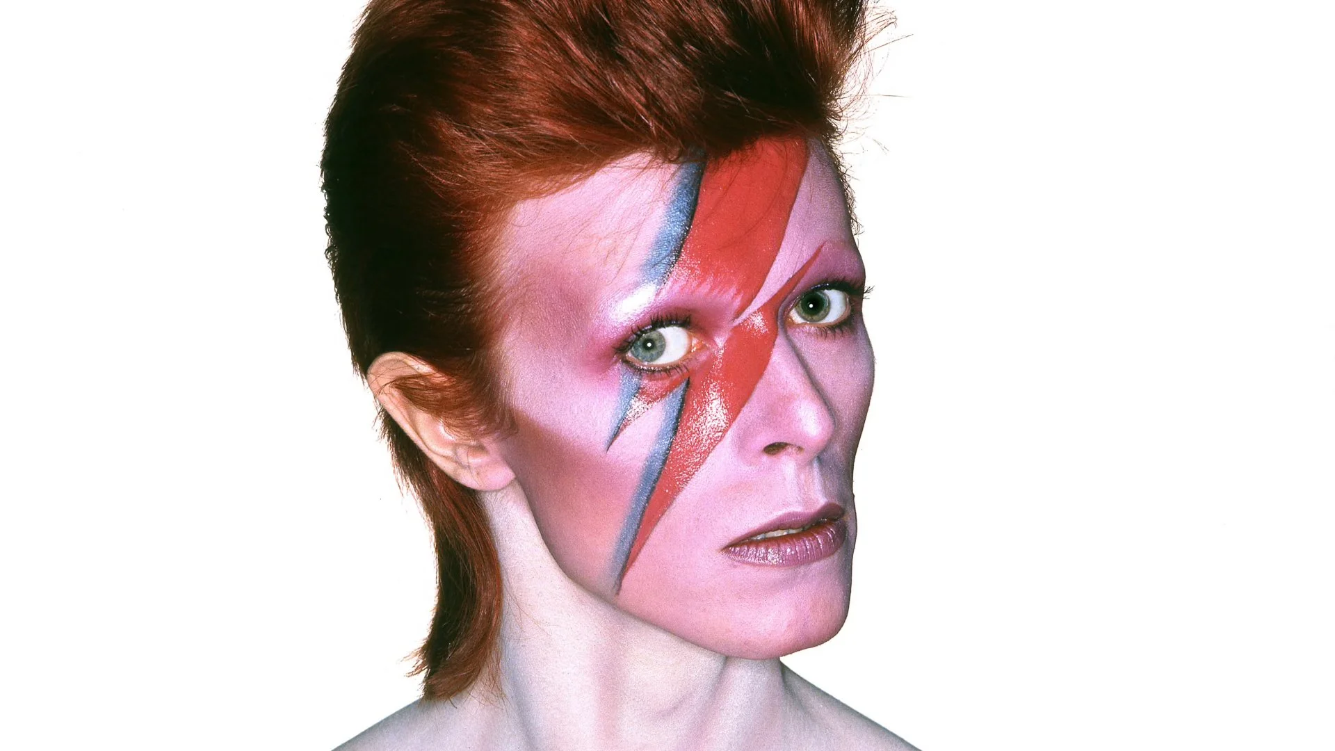
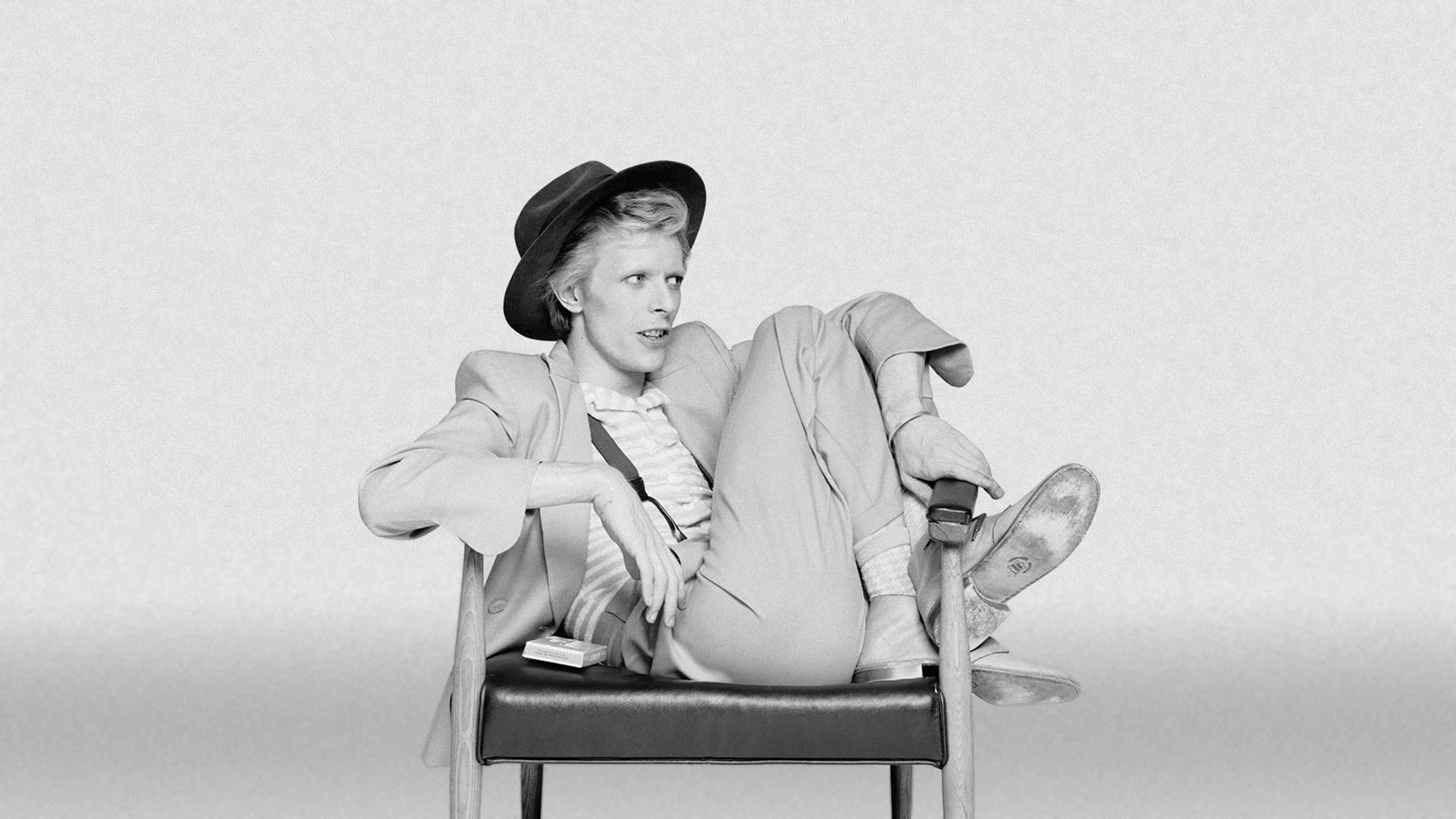
A shot by Brian Duffy, the legendary British photographer responsible for creating and capturing the iconic red and blue lightning bolt makeup on David Bowie’s face for the cover of his 1973 album, Aladdin Sane.
The strongest identities often work this way. You may not be able to describe exactly what makes them recognisable, but you can feel that the pieces belong together.
Bowie's career is an extreme example because he deliberately constructed different personas. But the underlying principle is useful at a much smaller scale. A local musician does not need Ziggy Stardust's level of theatricality to benefit from thinking about their visual world. A singer-songwriter, electronic producer or band can have an identity that is much quieter and still be just as coherent.
The question is not how spectacular the identity is — it is whether there is something behind it.
What should stay the same?
This is perhaps the most difficult question for any artist developing a visual identity today.
If everything changes, nothing becomes recognisable. If nothing changes, the identity can become a cage.
The answer is unlikely to be found in a fixed set of colours or in using exactly the same logo on every surface. It is more likely to be found in a set of principles.
An artist might consistently favour raw photography over polished imagery. Another might build everything around typography. Someone else might use humour, restraint, maximalism or a particular relationship with colour. These principles can remain stable even when the actual visual output changes considerably.
This is also why blindly copying another successful artist's visual language rarely works. It may borrow the surface of recognition without understanding what created it.
Bowie did not become recognisable because he used dramatic make-up or unusual costumes. Those things were effective because they belonged to a much larger idea. Remove the idea and the individual visual elements become decoration.
The same applies to logos.
A distinctive logo cannot compensate for an undefined identity. A beautiful album cover cannot compensate for a visual world that disappears everywhere else. A striking Instagram profile cannot create a coherent artist brand if every new release starts from a completely different visual premise.
The work has to belong together, even when it does not look identical.
From Bowie to the artist today
There is a useful lesson here for artists working today, particularly those building their careers outside the largest music markets.
You do not necessarily need a complicated logo. You do not need to imitate the visual language of a major international artist. And you certainly do not need to make every album, poster and social media post look identical.
What is more valuable is understanding what people should recognise when they encounter something that belongs to you.
Perhaps it is the way you use type. Perhaps it is a particular visual tension, a colour, an attitude or a recurring photographic language. Perhaps it is the relationship between your music and the objects surrounding it. The important part is that these decisions are made deliberately rather than independently each time a new release appears.
For a smaller artist, this can also create something that is easily overlooked: continuity.
A person who discovers a song today might encounter the artist again six months later through a poster, then see a T-shirt at a concert, then come across a new video. If each encounter feels disconnected, the audience has to reconstruct the artist's identity from scratch. If the encounters share a recognisable visual logic, every new interaction reinforces the previous one.
That is how an identity accumulates value.
It is also why the physical side of music remains so interesting. A record, poster or piece of merchandise can become more than a promotional surface when it extends the same world into something tangible. It gives the audience an opportunity not merely to follow the artist, but to own a small part of the visual language surrounding the work.
The freedom to change
Perhaps the most interesting thing about Bowie is therefore not how many times he changed his appearance, but how confidently he allowed change to become part of his identity.
He did not build recognition by repeating the same image. He built it by making every new image feel intentional. An identity does not become strong simply because it is consistent. Nor does it become interesting simply because it is different. It becomes meaningful when the audience can sense a relationship between the parts — when change feels like development rather than randomness.
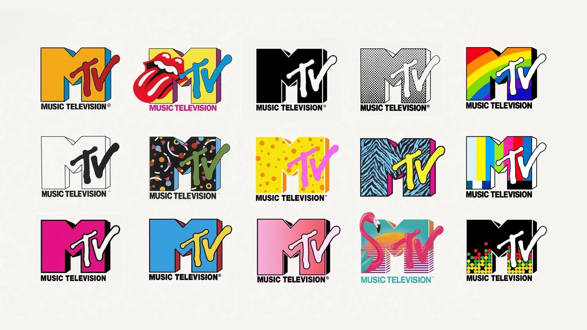
The Rolling Stones found that relationship in a symbol that could survive decades. Bowie found it in transformation. MTV, in a different medium, took the idea even further by turning its logo itself into a flexible visual container, allowing the same basic form to constantly change according to the culture around it.
Three very different approaches, but all built around the same fundamental problem: how do you remain recognisable while allowing the identity to live?
For artists today, perhaps the better question is not “What should my logo look like?” but “What should people recognise when they see something that belongs to me?”
The answer might be a logo. It might be a typeface, a colour, a photograph, a character or an entire visual world.
David Bowie showed that sometimes the most consistent thing about an identity is its ability to change.
