The illusion of choice in design
A client asks for five logo options. It sounds like a reasonable way to find the right one. If the first direction is not quite right, perhaps another will be.
But a request for more options often points to a different problem: the client is not yet sure what the right answer should be. More designs can make that uncertainty harder to resolve. They give the client more to compare, but not necessarily a clearer basis for choosing.
Why clients ask for more logo design options
When a client looks at a design, they see a visual result: a shape, a colour, a symbol, a name. The designer sees those things too, but also the brief behind them: the audience, the business, the concept and the decisions that connect one to another.
This difference is part of the work. A designer may need to solve one problem across two contexts, creating a visual solution that is strong in both while supporting the same concept. That involves more than producing something attractive. It means making decisions about meaning, recognition, tone and use at the same time.
People who do not work with design every day may not see that process. That is understandable. It does not mean the client is wrong to ask for options, or the designer has failed to explain the work. It means the specific nature of the task needs to be made visible.

Why one design brief cannot produce five different concepts
A brief sets the conditions for the design: what it needs to communicate, who it needs to reach and what it needs to do. When those conditions stay the same, the work can explore different visual expressions of one direction. But those variations are not automatically different concepts.
If the client wants genuinely different directions, the brief needs to open up different questions. Should the brand feel established or disruptive? Should it speak primarily to specialists or a wider public? Is it competing through expertise, accessibility or something else?
Each answer can lead to a different design direction. Without those distinctions, the designer is being asked to make the same answer look different.
Developing several meaningful directions takes research, thinking and design time. Each one also needs to be presented and evaluated. More options therefore mean more work and a larger budget.
That work can be worthwhile when the client needs to compare different strategic choices. It is less useful when several options are produced simply because nobody is ready to decide. In that situation, a larger selection may look like progress while leaving the original uncertainty untouched.
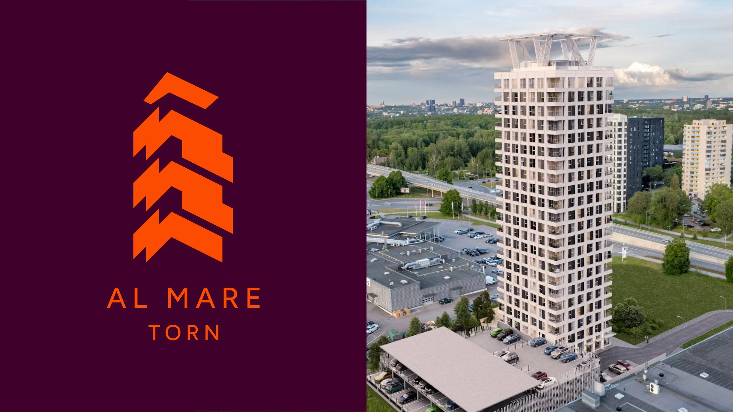
Identity for Al mare tower that represents the aesthetic and form of the building itself (Photo Fund Ehitus)
Why “Which logo do you like?” is the wrong question
When several designs appear on a screen, it is natural to ask which one the client likes. The question invites a quick reaction, but it does not tell us whether the design answers the brief.
People often choose what they understand most quickly. A familiar symbol or a restrained visual style can feel like the safest option because its meaning is already easy to read. That reaction is human. It is not, by itself, a design rationale.
A more useful discussion asks what each direction communicates, who it is for and how well it supports the brief. “I like this one” can begin the conversation. It should not have to end it.
How clients and designers should evaluate design concepts
The designer should explain the thinking behind a direction: what it is intended to do, what it makes possible and what trade-offs it involves. The client should also be able to explain why a direction fits the organisation and its needs.
That does not mean every response needs to sound technical. It means the decision should connect to something beyond personal preference: the audience, the brand’s position, the purpose of the work or the way it needs to function.
If the designer has to explain the rationale, the client’s choice needs a rationale too. Otherwise, the process stops at taste—and the design has not been evaluated against the problem it was meant to solve.
Why presenting design is part of the design process
A concept does not explain itself when it appears in a presentation. It needs context. The designer must show how the direction follows from the brief and make the important differences between options clear.
That presentation is not there to persuade the client to choose the designer’s favourite. It helps both sides understand what is being chosen and why. The designer’s role is not to provide a menu and wait for a preference. It is to help the right choice become visible.
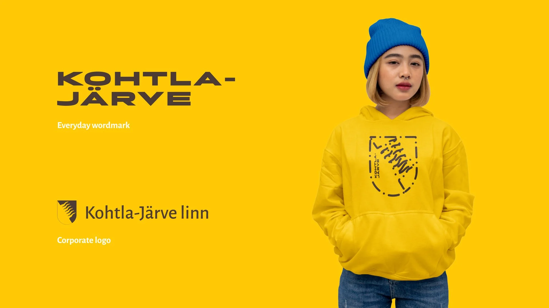
Identity for the city of Kohtla-Järve, where idetity lives two parallel directions (Photo Sviiter Studio)
Does more choice lead to better design?
When a client asks for more options, it is often useful to return to the brief. What is still uncertain? Which decisions need to be explored? Are there genuinely different directions to compare, or are the requested options all expected to solve the same problem in the same way?
Answering those questions can lead to fewer, more meaningful concepts—and a better discussion about the work. The goal is not to remove choice. It is to make each choice useful.
A design process should not end with “we liked this one best.” It should end with a direction the client and designer can both explain: what it does, why it fits and how it solves the problem.