Typography as a silent salesperson
Typography is rarely the first thing people comment on when they see packaging, advertising or any visual communication. Nobody praises good kerning, carefully chosen line spacing or a refined ligature — and precisely because of that, typography is one of the most powerful tools in visual identity.
Typography works like a salesperson who does not interrupt or shout for attention, but creates an atmosphere of trust, clarity and ease. In brand communication, this has a very practical meaning: good typography reduces friction. Poorly considered typography creates uncertainty — even when people cannot clearly explain what feels wrong. And when something feels cheap, confusing or “not quite right”, the cause is often not the logo or the colour palette, but the way language and type work together.
We have written about typography before as a core element of visual identity. If you want deeper background, you can also read our article Why typography matters in visual identity on our blog.
Why typography matters for business — even when nobody talks about it
Company leaders and marketing managers usually speak in terms of outcomes: visibility, sales, enquiries, conversions. Typography often appears in this conversation as a minor design detail that can be adjusted later. In reality, it is one of the first places where a brand creates either confidence or doubt — every day, across every channel.
Typography is the most frequently repeated visual element in any organisation. A logo might be noticed once; text is encountered constantly — on websites, proposals, presentations, manuals, packaging, social media posts and job advertisements. When typography lacks consistency or structure, the entire brand begins to feel uncertain. This is where the “silent salesperson” either does its job — or quietly fails.
Typography sells trust, not just information
Typography first and foremost sells trust. When text is difficult to read, too tight or too loose, poorly structured or overloaded with styles, people sense that something is off. They may not articulate it, but behaviour changes accordingly — less reading, fewer clicks, lower confidence.
Good typography is structured. Without using words, it signals what matters, what comes next and where to find detail. In brand communication, this works like a good conversation: nothing feels forced, and understanding flows naturally.
Consider a familiar situation: a sales team sends a proposal to a potential client. That document becomes the basis for a business decision. When the proposal looks chaotic — inconsistent styles, weak hierarchy, cramped spacing and a copy-paste feel — the service itself appears cheaper. Not because the content is weak, but because the form does not carry authority. Typography here functions as a sales tool. It either supports the sale or quietly undermines it.
Typography is a decision, not just a font
When typography is discussed, the conversation often drifts towards font names. In practice, the main issue is rarely the typeface itself. The real issue is whether decisions have been made about tone, rhythm and structure.
Typography means deciding headline sizes and weights, paragraph spacing, line length, alignment, hierarchy, link styles, emphasis rules and numerical treatment. When these decisions are defined, a brand feels confident even with a simple typeface. Without them, a brand feels uncertain — even when using an expensive font.
This is why typography belongs firmly inside visual identity guidelines. When rules are documented, internal teams and external partners no longer need to reinvent solutions for each situation. Typography stops being a matter of taste and becomes part of a system that holds the brand together as channels and contributors multiply.
Digital versus print — one typeface behaves differently
Many organisations assume that having a “brand font” solves the problem. In reality, the same typeface behaves very differently on screen and in print. Screens demand different sizes, spacing and contrast; print introduces paper choice, ink density and production constraints.
This explains why something that works online can fail in print. Good typography considers context. That is also why brand guidelines should include clear rules for both digital and print environments.
Typography as a scaling tool
In small organisations, it often feels manageable to solve issues case by case. As a company grows, complexity increases rapidly. Marketing creates campaigns, sales prepares presentations, HR publishes job ads, product teams write manuals, partners use logos and names. Without a shared typographic system, visual inconsistency grows fast.
This is not a design failure — it is a structural one. Typography is one of the simplest and most effective ways to maintain cohesion in a growing organisation. It costs less than constant corrections and saves time by removing the need to start from scratch each time.
A small real-world example with a big impact
A common scenario involves logos and text being squeezed into limited spaces. A partner receives a logo for a banner, compresses it to fit, removes breathing space and adds text in a mismatched typeface. Nobody intended harm, but the result damages brand perception. Not dramatically — but gradually and repeatedly.
Clear typographic and usage rules prevent these situations. Guidelines do not restrict flexibility; they create clarity.
What companies can do today?
Typography does not require an 80-page manual. A simple, well-considered document is enough to start. Decide on a primary typeface and its use cases. Define basic hierarchy for headings and body text. Create templates for proposals and presentations. Include examples of good and bad usage. Finally, assign responsibility — typography is not only a design concern, but a management one.
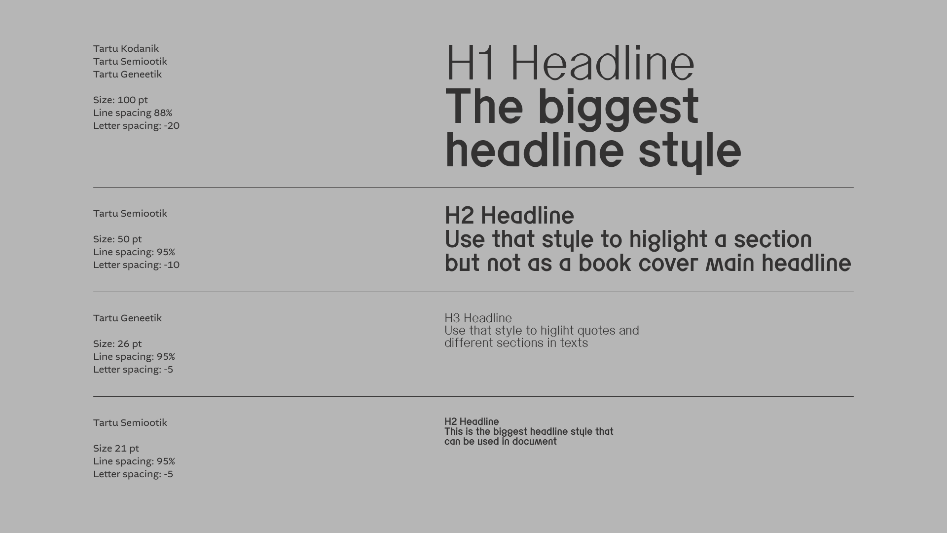
Typography hierarchy of the City of Tartu — cvi.tartu.ee/tupograafia/
A final note
If visual identity guidelines already exist, consider making them publicly accessible — at least for media and partners. Public guidelines reduce improvisation and protect brand integrity. Typography is a silent salesperson. When it works, people do not think about design. They focus on the message — and that is the point.