Famous logos XXIII — National Geographic
How the yellow frame became one of the most recognisable visual identities in the world
National Geographic is among those brands whose identity is built not around a traditional symbol, but around a framework. The yellow rectangle that originally appeared on the magazine cover to emphasise the impact of photography has gradually become the central element of the entire National Geographic visual language.
It is a form of design that does not attempt to dominate the content, but instead creates context for it. In the case of National Geographic, the identity is structured so that the content — photographs, stories and discoveries — always remains at the centre of attention.
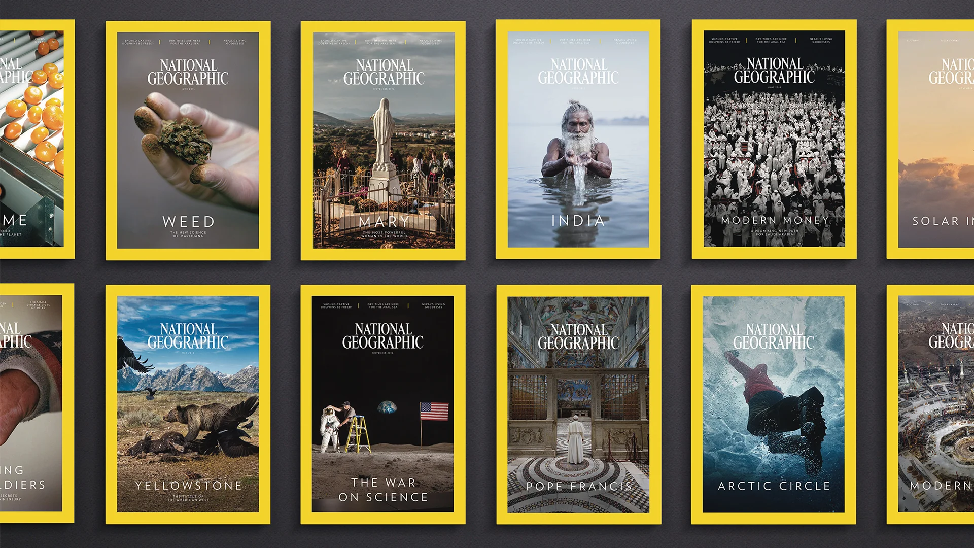
Selection of National Geographic covers
The origins of National Geographic
The National Geographic Society was founded in 1888 in Washington, D.C., with the goal of advancing knowledge about geography, nature and the cultures of the world. The first issue of National Geographic Magazine was published later that same year.
During its early decades the publication had no strong visual identity. Covers were largely text-based and academic in tone, reflecting its origins as a journal produced by a scientific society.
At the beginning of the twentieth century this began to change. Photography gradually became one of the magazine’s defining strengths, and images started appearing on the cover. The publication evolved into a visual window to the world — a place where readers could see landscapes and cultures they might never encounter themselves.
The birth of the yellow frame
The now iconic yellow frame appeared on the cover in the late 1950s, when the magazine began searching for a clearer visual structure for its layout. The yellow rectangle was not originally intended to function as a logo. Instead, it served as a design element that framed the cover image and kept the composition visually consistent.
The simplicity of this solution proved remarkably powerful. The yellow colour stood out clearly on newsstands while never competing with the photography. The frame worked almost like a physical picture frame, directing the viewer’s attention toward the image.
Over time readers began to associate the publication with this distinctive frame. The yellow rectangle gradually evolved into a visual marker through which the magazine could immediately be recognised.
The frame as identity
What makes National Geographic’s identity unique is that its “logo” is not really a symbol, but a spatial structure. The yellow frame creates visual continuity while allowing each cover to remain entirely different.
This approach enables every issue to feature a unique photograph while still maintaining a consistent identity. The frame separates the magazine visually from others on the shelf and helps maintain compositional balance even when the cover images vary dramatically.
In essence, the yellow rectangle functions as a window through which readers observe the world — whether that world consists of wildlife, cultures or scientific discovery.

Frame as the cornerstone of National Geographic
Photography at the centre of the identity
Over the decades National Geographic has helped define the standards of visual storytelling. The magazine is known for its iconic photography, many examples of which have become part of photographic history.
One of the most famous examples is Steve McCurry’s photograph “Afghan Girl”, taken in 1984 and published on the magazine’s cover in 1985. The image quickly became one of the most recognised portraits in the world and remains one of the defining moments of modern photojournalism.
More about the photographer can be found on Steve McCurry’s official website: https://www.stevemccurry.com
In cases like this the yellow frame performs its role perfectly. It does not compete with the image or try to overpower it. Instead, it reinforces it, placing the photograph within a recognisable context. The frame and the photography together form a system in which identity and content support each other.
Visual evolution
Although the yellow frame has remained central to the brand’s identity for decades, the design of the magazine’s covers has evolved over time. Earlier covers often included more text and followed a more traditional editorial layout.
From the 1990s onward the design became increasingly minimalist. Text elements were reduced, photographs became larger, and the yellow frame remained almost the only permanent visual element. Today the photograph often fills nearly the entire cover, while the frame serves as a clear and recognisable identity marker.
This evolution demonstrates how a strong identity element allows design to change over time without sacrificing recognisability.
Expansion into television and digital media
During the 1990s National Geographic expanded beyond the magazine format. Documentary films, television channels and later digital platforms required an identity that could function across different media.
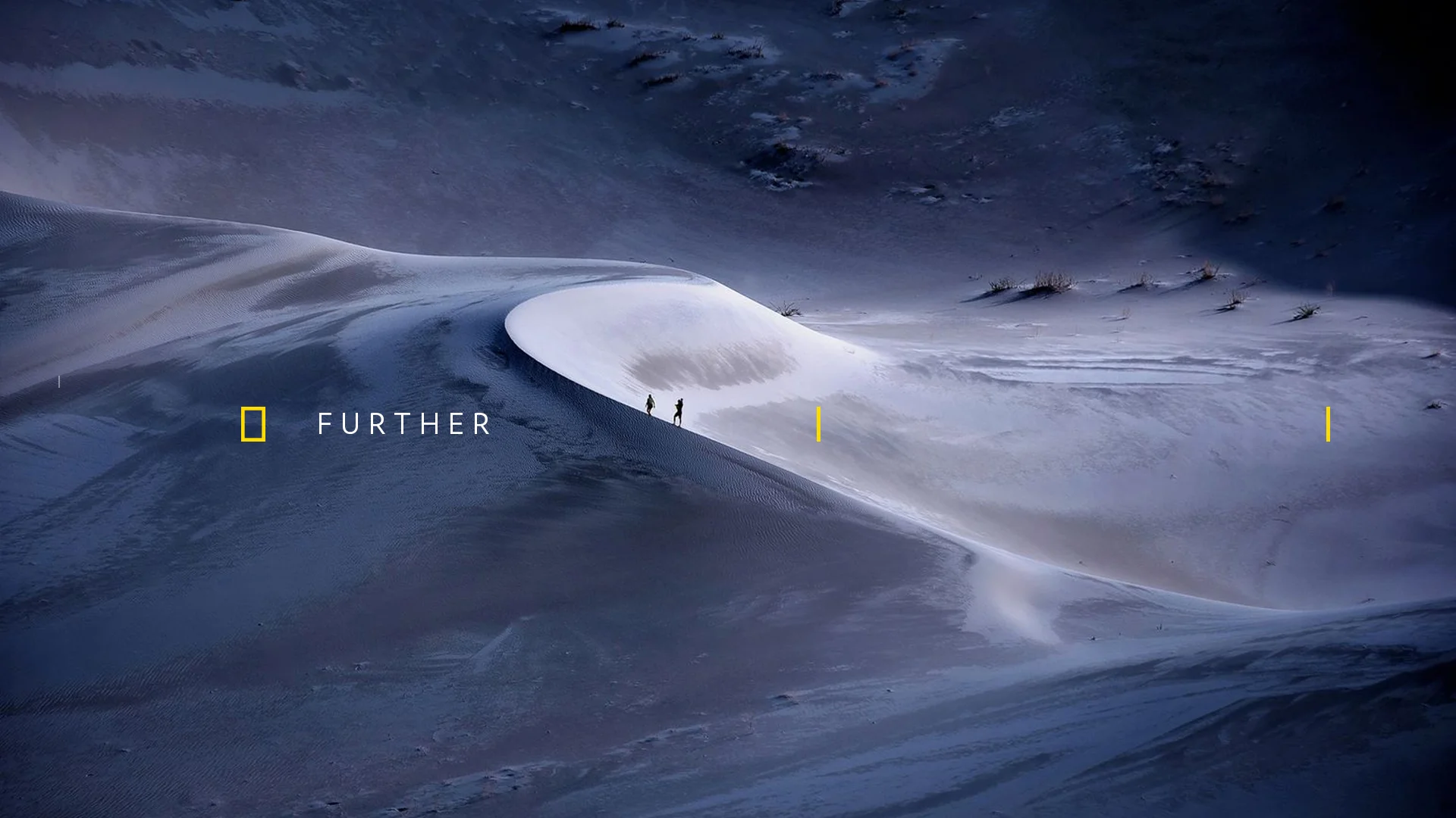
The yellow frame proved particularly adaptable. It could easily be used in television graphics, websites and social media environments. Because the form is simple and geometric, it works equally well on small mobile screens and in large-scale formats.
In 2016 the brand identity was updated following the consolidation of the media business under National Geographic Partners. The redesign was developed by the New York design studio Gretel, which focused on strengthening the existing symbol rather than replacing it. The studio’s case study can be explored here: https://gretelny.com/national-geographic
The yellow frame remained the central element and was integrated more systematically across different platforms.
Vertical format in the digital age
Interestingly, the yellow frame also works remarkably well in today’s digital environment. Although it originated from the proportions of a printed magazine cover, its vertical format closely resembles many contemporary screen formats.
Mobile screens, social media posts and vertical video all rely on upright compositions. As a result, a form created for print media more than half a century ago aligns naturally with the visual logic of today’s mobile-first digital world.
This compatibility was never an original design objective, yet it demonstrates how simple and universal forms can remain relevant even as technology evolves.
National Geographic and Estonia
National Geographic’s history also has a connection to Estonia. One notable figure is Priit Vesilind, an Estonian-born writer and photographer who worked for the magazine for decades and contributed numerous international stories.
More about his work can be found here: https://en.wikipedia.org/wiki/Priit_Vesilind
His career is an example of how contributors from smaller countries have played a role in shaping one of the world’s most influential publications.
Estonian photographers have also appeared in National Geographic’s wider community platforms. In 2014, a dramatic lightning storm photograph by Estonian photographer Kristjan Madalvee was featured by National Geographic through its Your Shot platform. The image was accompanied by the fact:
“Friday Fact: There are about 3,000 lightning flashes on Earth every minute.”
The photograph, captured over the Baltic Sea, demonstrated the same visual storytelling principles that have long defined National Geographic’s photographic tradition.
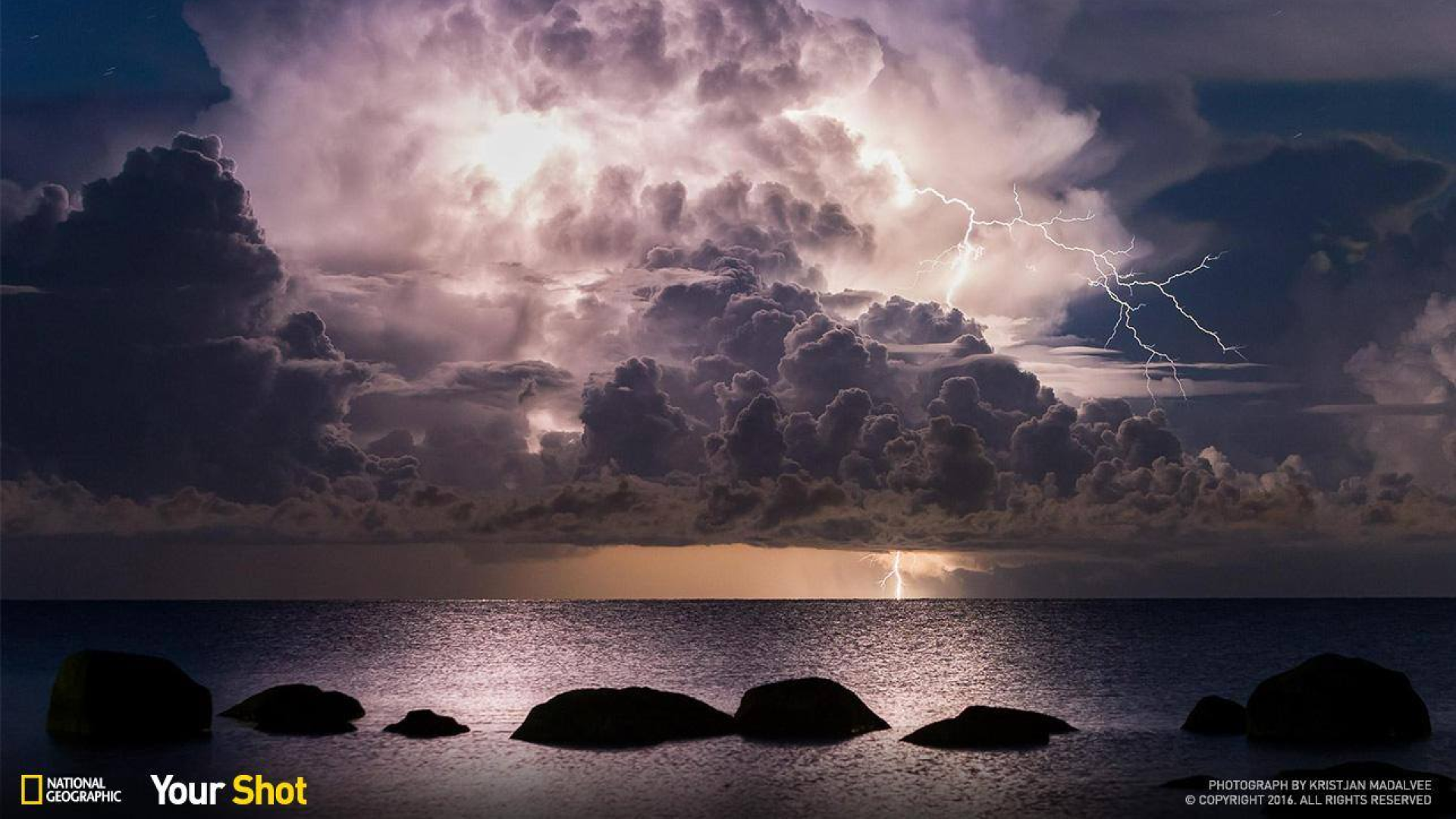
Photograph by Kristjan Madalvee (Vergi harbour - 59.60021158643927, 26.100472113341638)
Why the identity works
The visual identity of National Geographic has remained strong for more than half a century because it is built on simple and durable design principles. The yellow frame is geometrically clear, instantly recognisable and independent of changing design trends.
Equally important is the fact that the identity never attempts to dominate the content. Photography and storytelling remain central, while the frame functions as a system that allows those elements to stand out.
The yellow rectangle is therefore one of those rare design solutions that is both extremely simple and remarkably powerful. It is not an illustrative symbol or a complex mark, but a framework that allows the content to take centre stage.
Sometimes the most effective design is not the one that draws attention to itself, but the one that quietly frames the world for others to see.