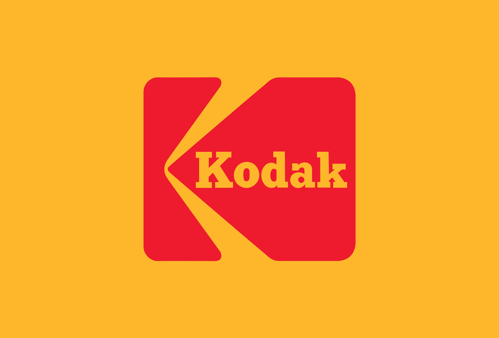
Famous logos XXIV — Kodak
Few brands have shaped the way we remember the world as profoundly as Kodak. For more than a century, the company was synonymous with photography itself. Family holidays, birthdays, weddings and historical events were captured through Kodak film, making the brand part of both personal and collective memory.
Yet Kodak’s story is not only about photography. It is also about technology, disruption, and the difficult relationship between innovation and identity. While many logo evolution stories focus on visual change, Kodak offers something more interesting: a chance to explore whether a brand can remain iconic even when the business behind it loses relevance.
From Kwanon to Canon? No — from Eastman to Kodak
Founded in 1888 by George Eastman, Kodak emerged at a time when photography was still a specialist activity. Cameras were expensive, processes were complicated, and image-making was largely reserved for professionals.
Eastman’s ambition was different. His famous slogan, “You press the button, we do the rest”, reflected a radical idea: photography should be accessible to everyone. This philosophy became one of the earliest examples of user-centred design. Kodak did not merely sell film or cameras. It simplified a complex process and transformed it into an everyday experience. The company’s visual identity would eventually reflect this same ambition — clarity, accessibility and recognisability.
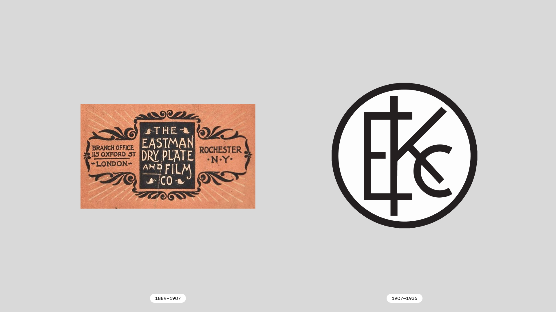
Building recognition before branding existed
Kodak’s earliest logos reflected the decorative aesthetics of the late nineteenth century. Like many companies of the era, the focus was on typography rather than symbols. Yet Kodak possessed one unusual advantage: its name. George Eastman deliberately invented the word “Kodak” because it was short, distinctive and impossible to confuse with competitors. He reportedly liked the letter K and wanted a name that sounded strong and memorable in multiple languages.
Long before modern branding theory emerged, Kodak already understood one of its core principles: differentiation. The company did not inherit a name from geography, family history or product description. It created one from scratch.
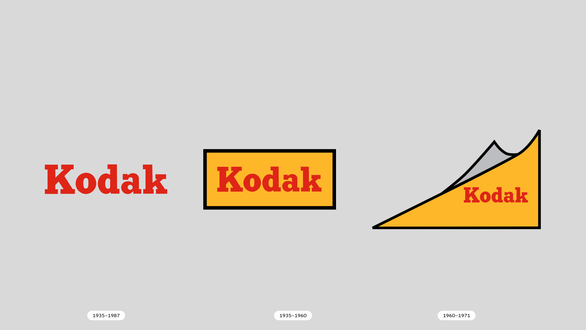
The rise of the Kodak red
During the twentieth century, Kodak developed one of the most recognisable visual identities in the world. The combination of red and yellow became inseparable from photography. The colours were not chosen merely for aesthetics. They worked exceptionally well in retail environments. Camera shops, film packaging and promotional materials needed to stand out among competitors, and Kodak’s bright palette achieved exactly that.
Long before digital interfaces and social media feeds competed for attention, Kodak understood the value of visual visibility. The company became so successful that its colours eventually functioned as a brand identifier even without the logo itself.
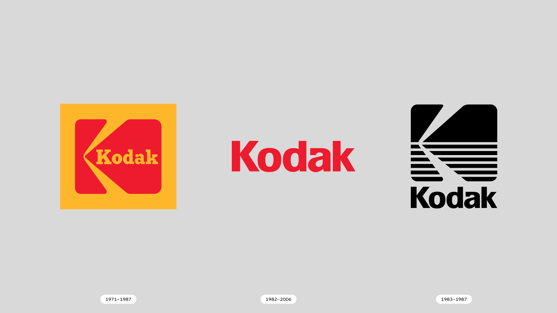
The arrival of the “K”
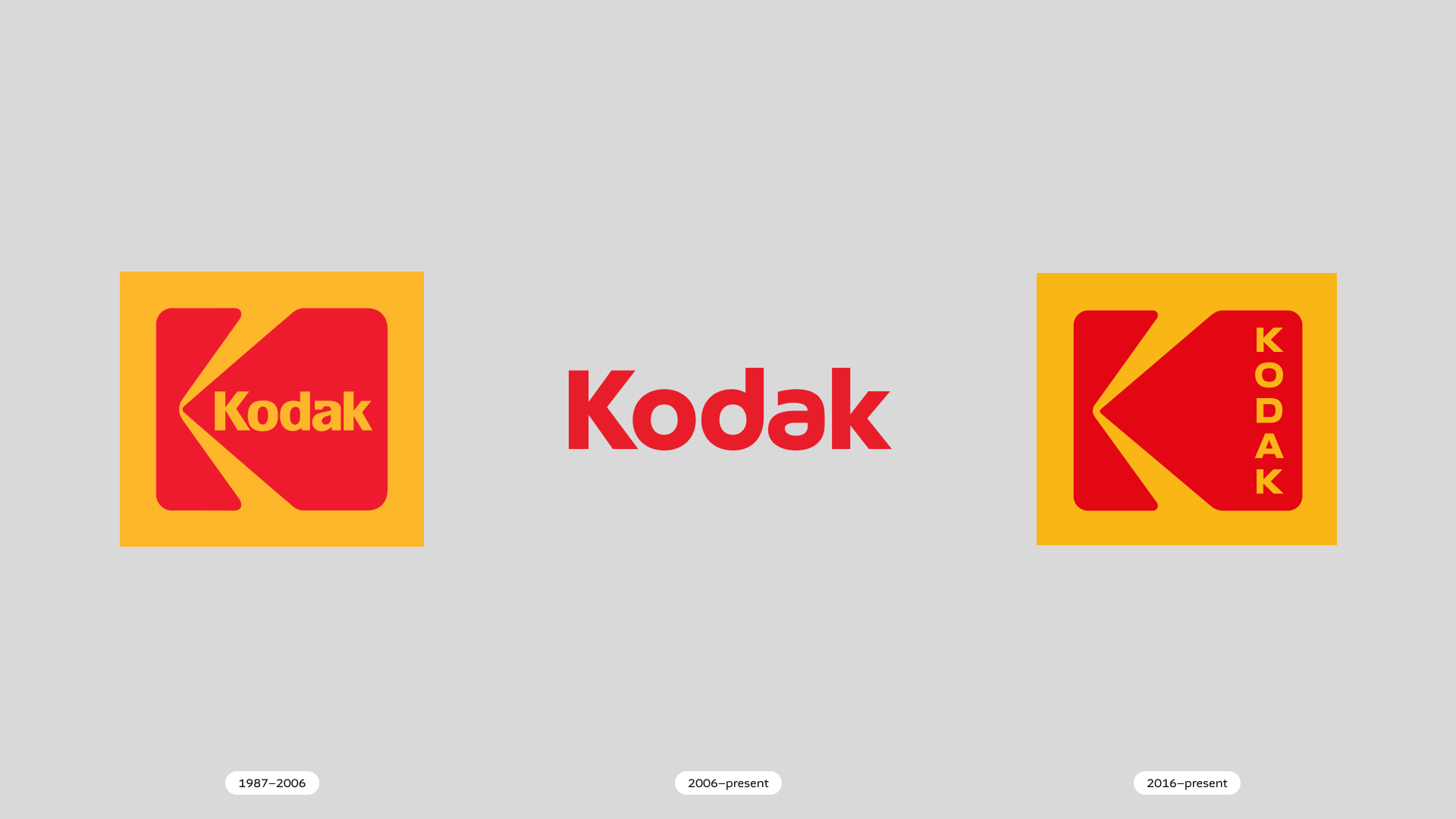
One of Kodak’s most influential identity developments came in the 1970s when the company introduced its famous K symbol. The logo was created during a period when many corporations embraced modernist design principles. Around the world, companies were simplifying identities, reducing ornamentation and adopting geometric forms that worked across print, packaging and emerging media. Kodak’s K symbol followed this trend. It transformed the brand name into a compact graphic mark that could function independently from the wordmark while remaining instantly recognisable.
Unlike many logos from the same period, it managed to balance simplicity with character. The symbol felt modern without becoming anonymous. This is perhaps why the mark remains one of the most beloved elements in Kodak’s visual history.
When technology changes faster than identity
For most of the twentieth century, Kodak’s identity evolved alongside its business. Film remained the foundation of photography, and the company remained one of its dominant players. The digital revolution disrupted that relationship. Ironically, Kodak itself developed one of the first digital cameras in 1975. Yet despite recognising the technology’s potential, the company struggled to adapt its business model. Digital photography threatened the highly profitable film ecosystem upon which Kodak’s success had been built.
This created a dilemma that many large organisations still face today. Innovation is relatively easy when it complements an existing business. It becomes much harder when it threatens it. While photography moved rapidly into the digital age, Kodak’s position within the industry became increasingly uncertain.
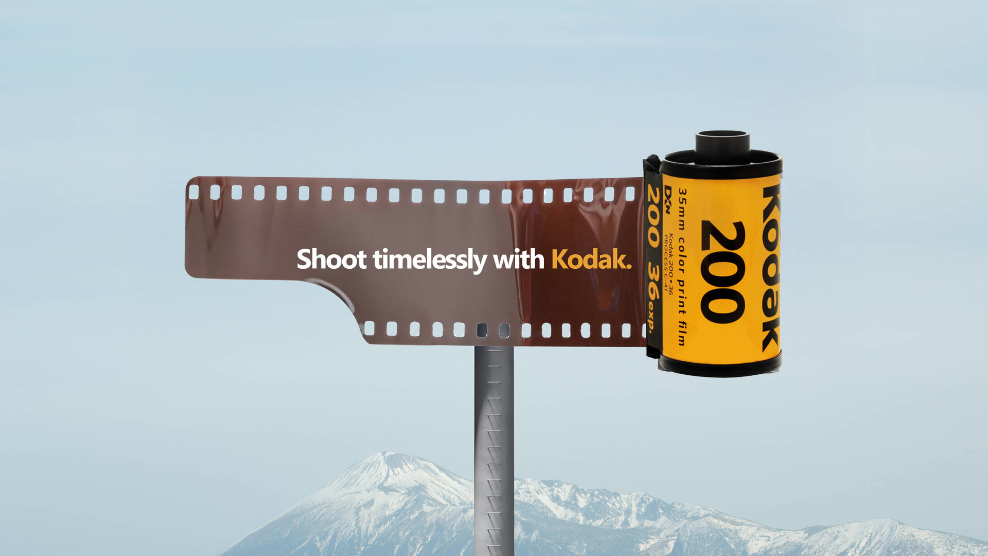
Sample of advertising: S.I. Newhouse School of Public Communication published the advertisement sent called Timeless to uplift the Kodak’s influence to the everlasting photography.
The redesigns of the digital era
The twenty-first century brought several attempts to modernise Kodak’s identity. Some redesigns simplified the logo further. Others removed or reduced elements that had defined the brand for decades. Like many companies entering the digital era, Kodak sought flexibility across screens, interfaces and smaller applications.
Yet something interesting happened.
Although the logos became cleaner and more technically adaptable, many observers felt that they lost some of the personality associated with Kodak’s historical identity. This highlights an important distinction in branding. A logo can evolve to meet new technical requirements, but it cannot automatically replace emotional associations accumulated over generations. The challenge was not simply updating a symbol. It was preserving meaning while adapting to a fundamentally different technological landscape.
Why Kodak remains relevant?
Today, Kodak occupies a very different position than it did during its peak. For many consumers, the brand no longer represents the future of photography. Yet it remains one of the most recognisable names in the history of visual culture. This demonstrates something that designers often encounter in practice. A strong identity can outlive the conditions that created it. Recognition, however, should not be confused with relevance.
Kodak’s logo remains familiar because it was attached to decades of cultural presence, product experience and emotional memory. But the company’s commercial challenges also reveal the limits of branding itself. A logo can help people recognise a company. It cannot guarantee that the company continues to lead its market.
The evolution of Kodak’s logo is not primarily a story about graphic design. It is a story about the relationship between identity and change. Throughout its history, Kodak successfully adapted its visual language to new technologies, media and cultural expectations. Yet its greatest challenge was never visual. It was strategic. This makes Kodak a fascinating reminder that branding and business are deeply connected but not interchangeable. A strong identity can amplify a great product, clarify a complex offering and create lasting recognition. What it cannot do is solve problems that originate elsewhere. Perhaps that is why Kodak remains such an important case study today. Not because its logo changed, but because its story reveals both the power and the limits of design.