Green — the colour of balance, responsibility and time
Green is one of the most demanding colours in visual identity. It carries meaning before a single word is read. Growth, balance and responsibility are embedded in it — along with strong associations to sustainability, ethics and long-term thinking. This is precisely why green should never be chosen casually or purely for aesthetic reasons.
When used thoughtfully, green supports brand consistency and builds trust without noise. When used superficially, it raises questions a brand may not be ready to answer.

Why green behaves differently from other colours
Green does not rely on contrast or urgency to attract attention. Its effect unfolds over time. It creates space, calms visual environments and supports readability. For this reason, green is often used in systems where trust and continuity matter more than immediate emotional reaction.
Green works particularly well in complex environments — services, institutions, platforms and organisations where visual identity must outlast individual campaigns. In these contexts, green is not a signal. It is a framework.
Green as a primary colour or an accent
The role of green depends on whether it carries the core idea of the brand or supports it from the background. As a primary colour, green sets the overall rhythm and tone of communication. It suits brands built around stability, continuity and a long-term perspective.
As an accent colour, green behaves differently. It balances stronger or more technical palettes, adding warmth and human presence to structured systems. In this role, green does not speak on its own — it reinforces what is already in place.
Strong visual identities make this distinction deliberately and avoid blending the two roles.
Green in international brand identities
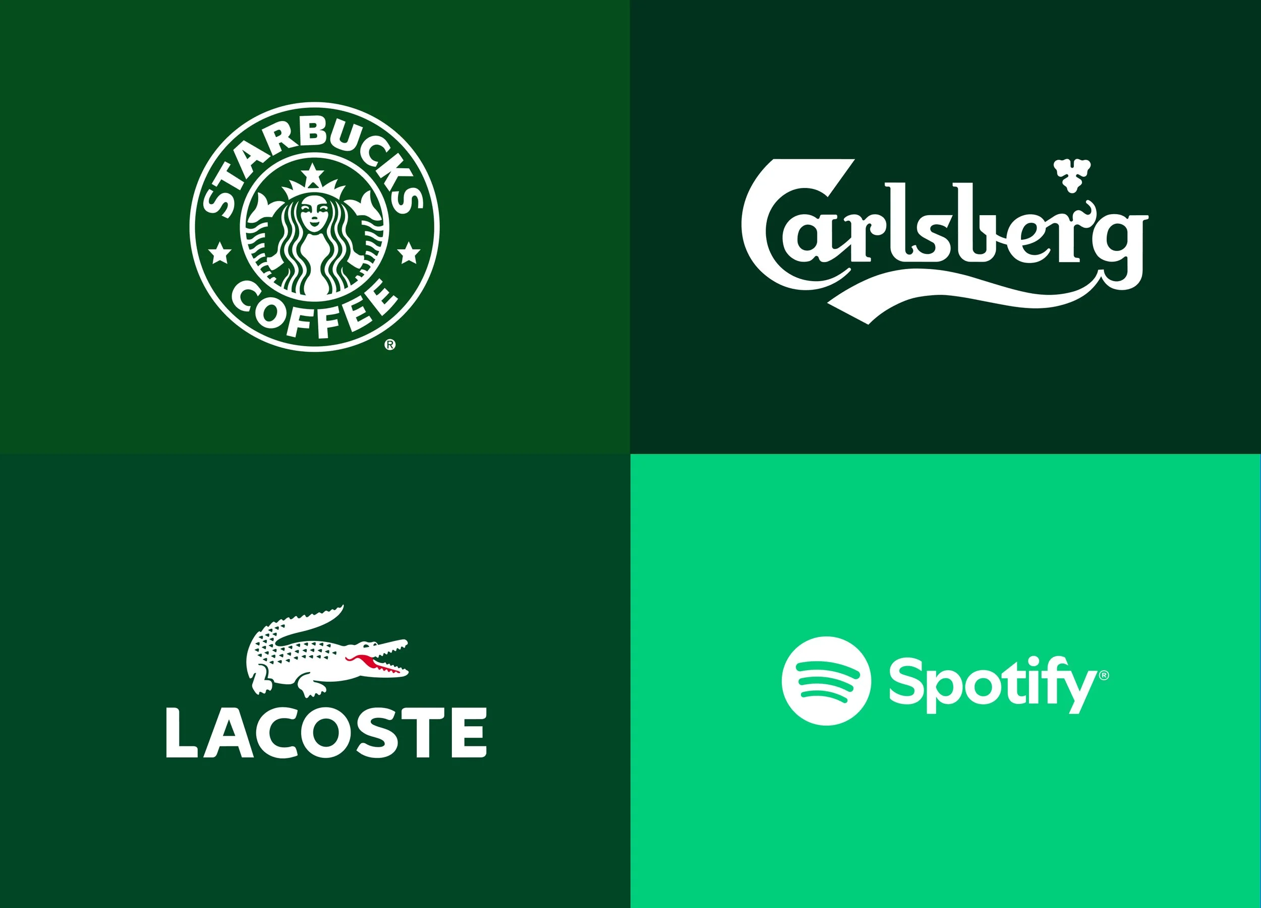
Internationally, green continues to play a central role in several well-established brand systems. Carlsberg uses green as a carrier of tradition and consistency, linking the colour to heritage, craftsmanship and quality. Lacoste employs green as a recognisable marker that supports its sporty elegance and timeless positioning, allowing the brand to remain restrained yet distinctive across decades.
In a more contemporary context, Spotify (see also the Famous logos series about Spotify) demonstrates how green can function within a digital-first ecosystem. Here, green acts as a high-contrast anchor against dark interfaces, creating instant recognition while supporting speed, motion and constant content change. Starbucks (see also the Famous logos series about Starbucks), on the other hand, uses green to communicate familiarity and scale — a colour that connects global presence with an idea of warmth, accessibility and everyday ritual.
Across all these examples, green is neither decorative nor trend-driven. It is embedded into systems that work across time, channels and cultural contexts. The colour does not carry the brand on its own — it reinforces decisions that have already been made at a strategic level.
Green and responsibility — where meaning turns into greenwashing
Green always comes with responsibility. Because of its strong link to sustainability and ethics, its use demands substance. When visual language promises more than the organisation can support through action, the disconnect becomes visible quickly.
The issue then is not design — it is trust. Green is not a solution by itself. It amplifies decisions, whether they are sound or superficial.
Green in Sviiter Studio’s work
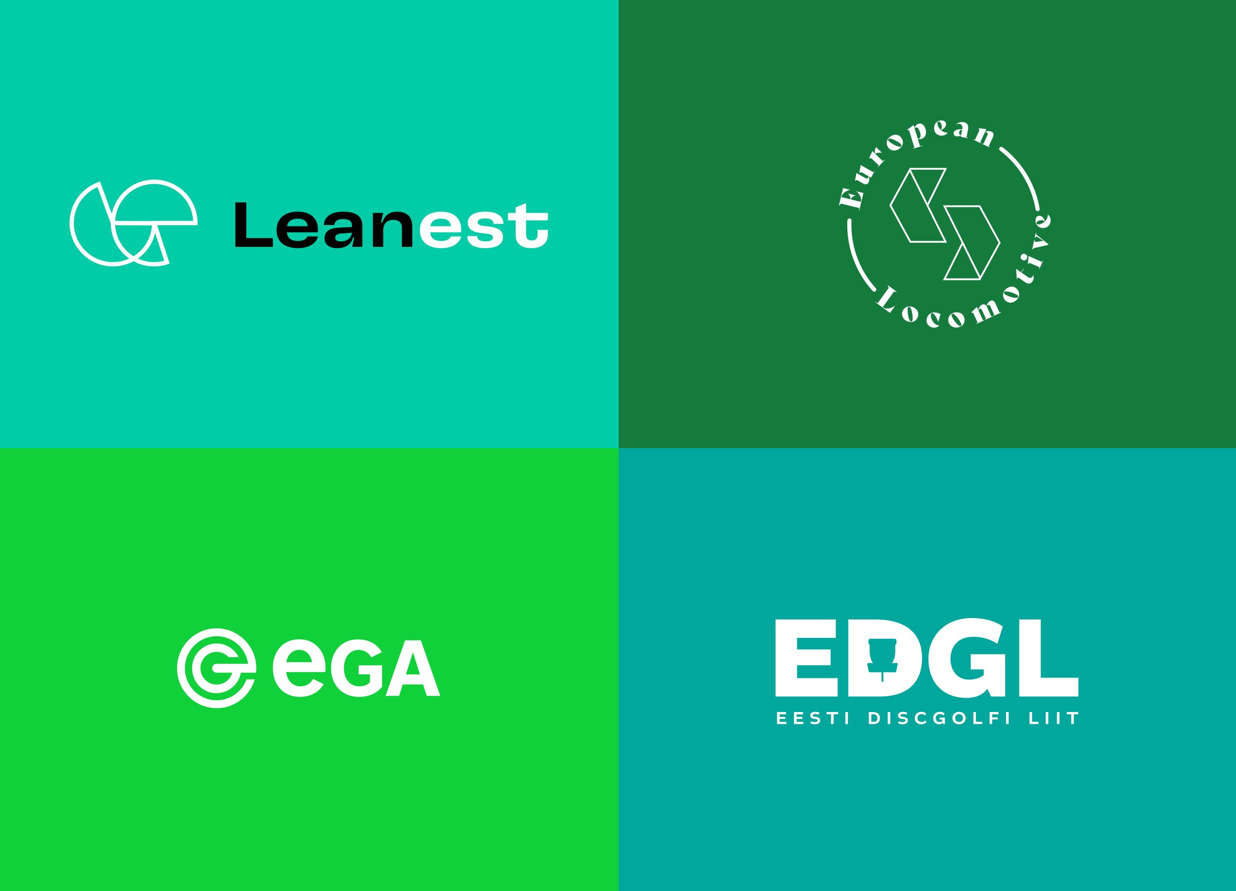
In our own projects, green has often played a balancing role rather than acting as a dominant statement. In Leanest’s visual identity, green creates clarity and calm, working alongside darker tones and leaving space for content to lead.
A similar approach appears in the visual language of the e-Governance Academy, where green supports institutional credibility and long-term thinking without becoming the message itself.
In the identity of the Estonian Disc Golf Association (EDGL), green functions primarily as an accent colour, linking the organisation to nature and movement without making explicit environmental claims.
We applied green to European Locomotive applied in their communication to counterbalance the visual weight of heavy machinery. The colour introduced a sense of openness and continuity, positioning the brand around longevity and future-oriented engineering.
When green is not the right choice
Green does not suit every brand. Fast-paced, impulse-driven or highly contrast-based identities may find traditional green limiting rather than empowering. That does not necessarily mean green must be excluded altogether.
Often the solution lies in variation — cooler greens leaning towards blue, warmer greens with yellow undertones, or very dark or very light greens. These shifts help brands avoid generic “eco-green” associations while retaining green’s balancing qualities.
In closing
Green is neither a trend colour nor a neutral background. In visual identity, it represents a deliberate decision to communicate balance, continuity and responsibility. When integrated into a system, green supports clarity and trust — even as the surrounding visual world becomes louder.
Green works best when it follows decisions, not when it replaces them.