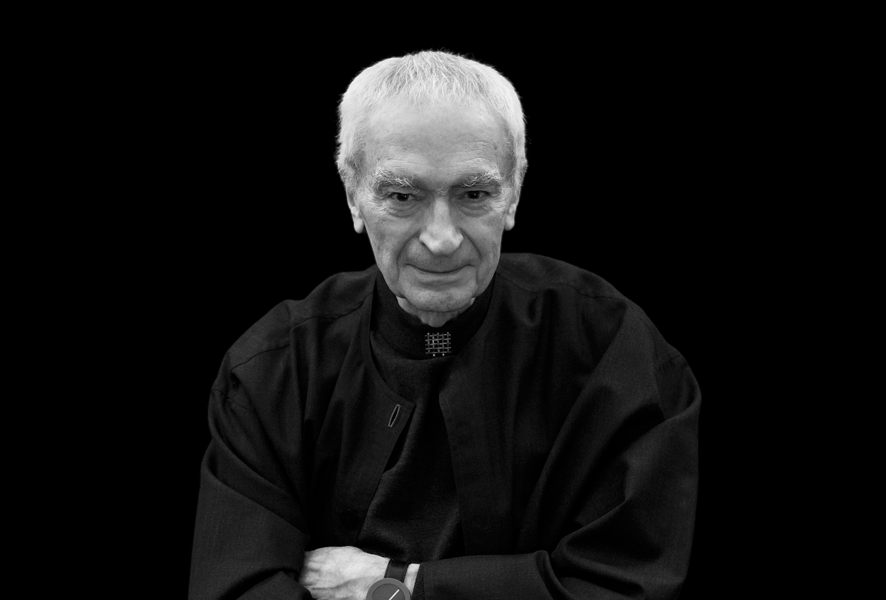
The new Bond now has a face: Robert Pattinson is stepping into a role shaped by different actors and eras for more than six decades. But each new casting does not mean starting from scratch. Before the first frame is shot, audiences already recognise the mark: 007, three numerals with a pistol worked into them. Pattinson’s casting was announced in November 2026.
Three numbers and a pistol
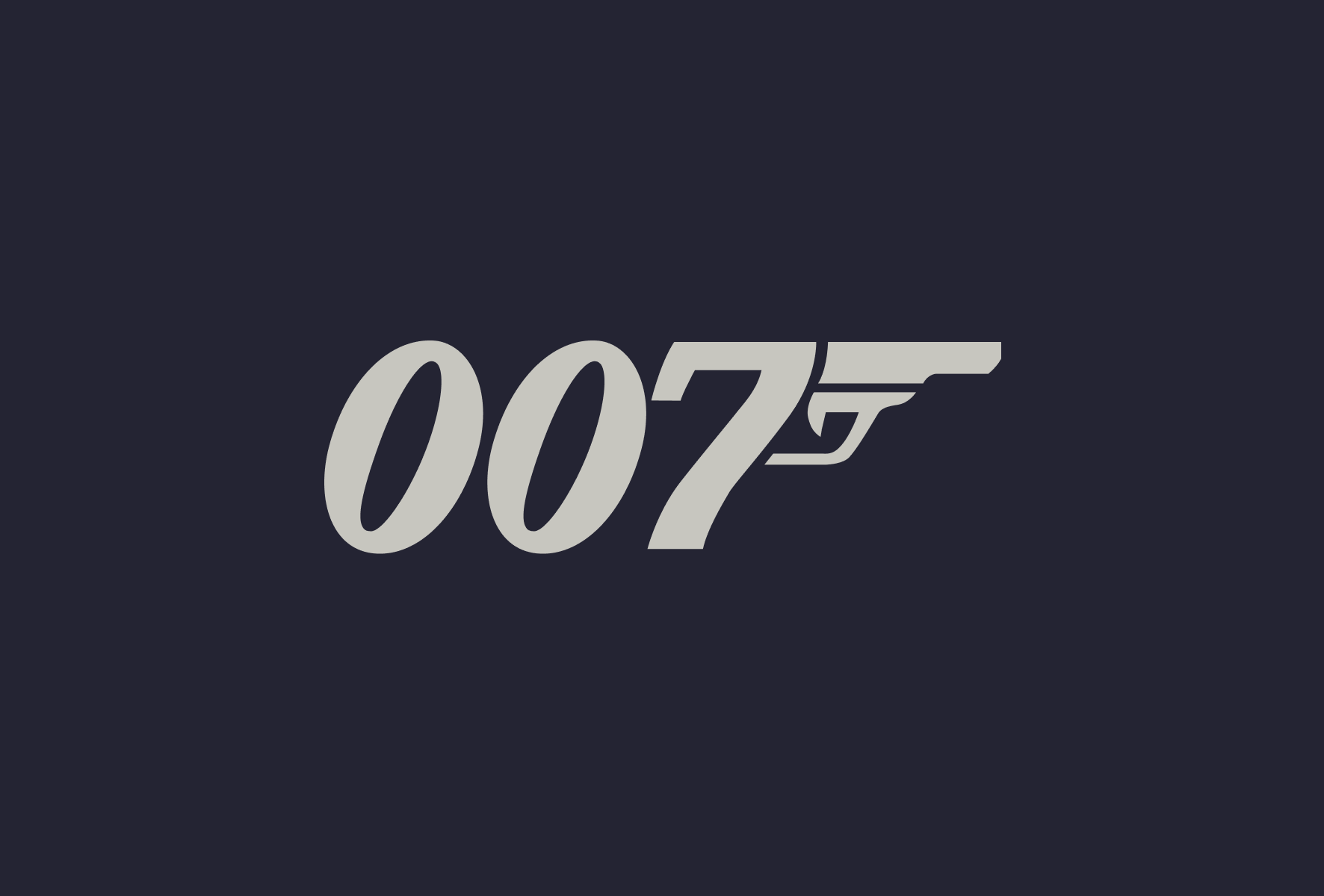
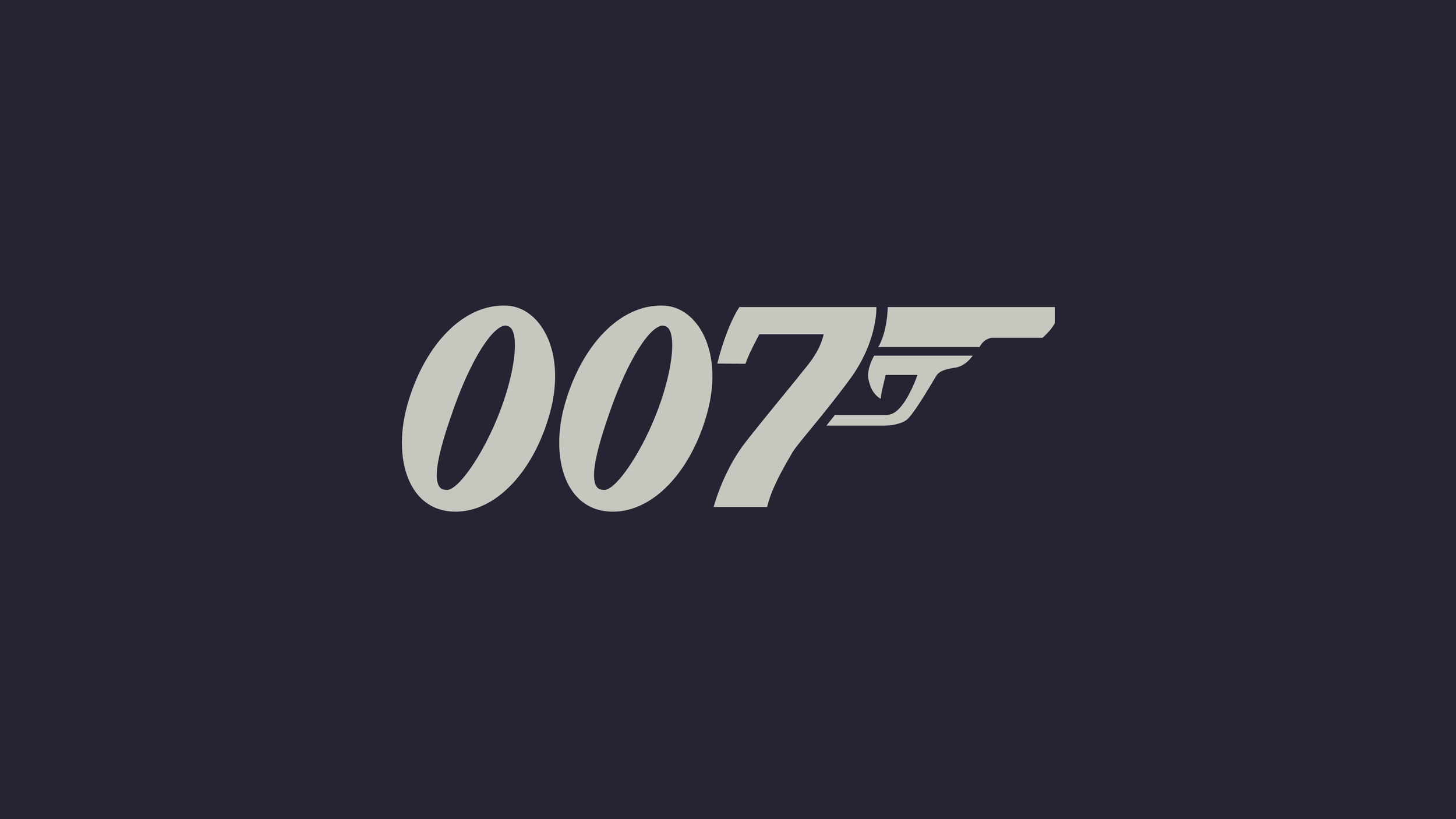
In 1962, graphic designer Joe Caroff was asked to create a logo for letterheads connected to the first Bond film, Dr. No. He received a flat fee of $300. Caroff saw that the final “7” could become the grip of a pistol. The secret agent’s code number and the weapon associated with his world became one mark. Both Eye Magazine’s profile of Caroff and The Guardian’s obituary recount the logo’s origin and its original use.
The solution is specific and economical. There is no need to spell out James Bond’s name or explain what 007 means. The number already identifies the character; the pistol adds danger and the language of espionage in an instant. The mark works on a cinema poster and on a small watch face. Its idea survives at either scale.
Caroff became known for other film designs, too. His 1961 West Side Story poster is often mistakenly attributed to Saul Bass, who designed the film’s animated title sequence. Caroff’s posters also include A Hard Day’s Night, Cabaret and Manhattan. In his work, lettering and concept often do more than sit side by side: each helps the other make sense. The 007 logo is an especially clear example.
A logo outside the film
Caroff’s 007 mark is first and foremost an emblem of the Bond franchise, seen on posters and other promotional material. It is not usually a recurring on-screen mark or a device within the film’s story. On screen, audiences recognise the Bond world through other signals: the gun-barrel sequence, the music, the title sequence and each film’s own title design.
That distinction matters. The logo can endure because it does not need a new role or appearance for every film. Each new instalment, meanwhile, can create its own visual introduction. Bond title sequences have changed over the years, with designers including Maurice Binder, Robert Brownjohn and Daniel Kleinman, while continuing a shared visual tradition. This overview of the Bond title sequences shows how each sequence connects a film to its own era and themes.
The sound identity is renewed in a similar way. Each Bond title song becomes an anticipated cultural moment, from Shirley Bassey to Paul McCartney, Tina Turner and Adele. The songs change with the times, while the 007 mark links the films into a longer story. The songs are not always chosen through a public competition, but every new choice brings its own speculation and anticipation.
Now Robert Pattinson enters that legacy. His Bond will be a new interpretation, but not a blank page: audiences already have familiar visual and sonic cues through which to recognise the character. Caroff’s logo does not need to change for Pattinson to enter the Bond world. Its strength lies in belonging to the character and the series more than to any one actor.
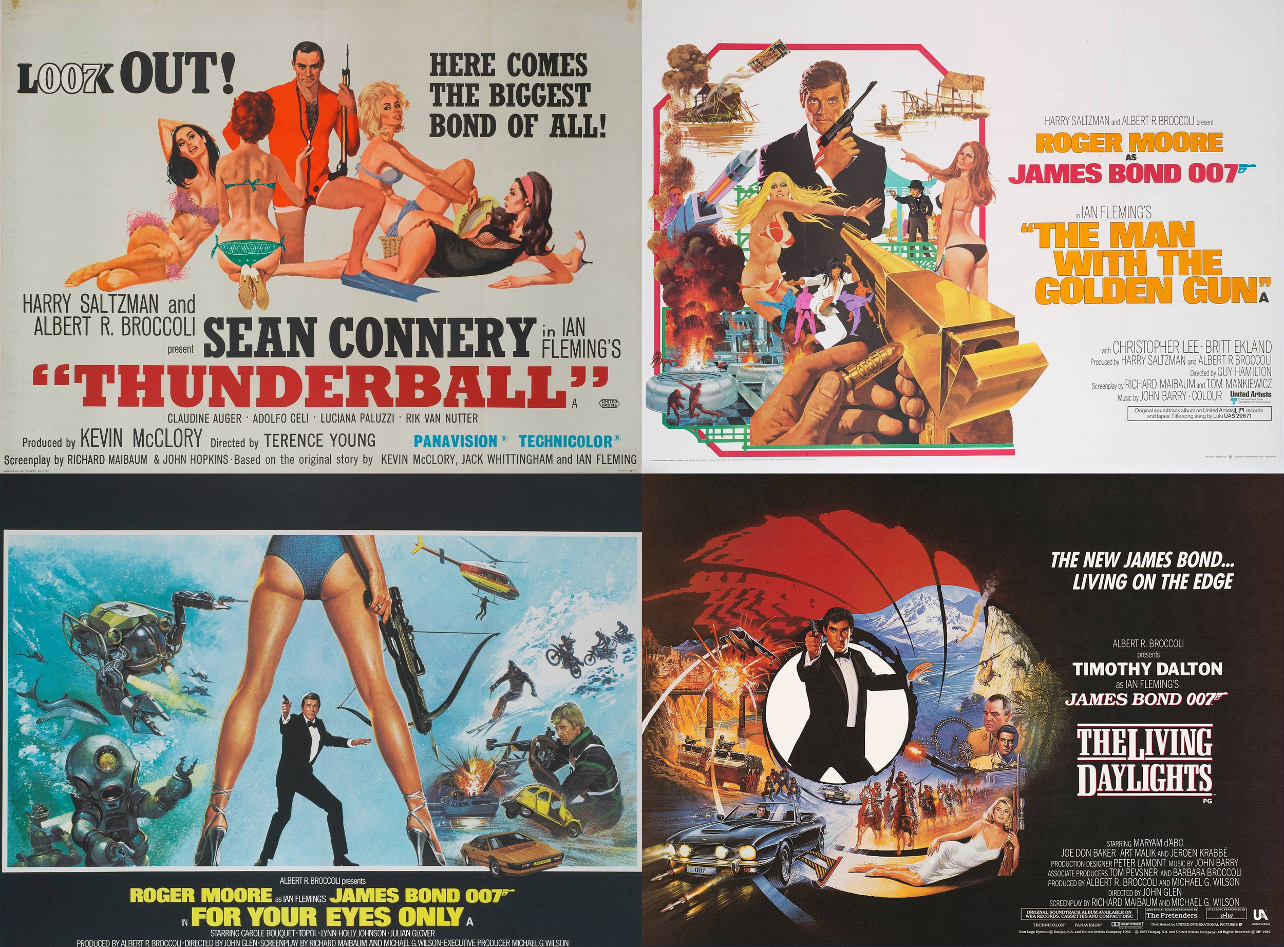
Movie posters from the era. Source 007.com